import numpy as npimport matplotlib.pyplot as pltimport pandas as pdfrom matplotlib.dates import DateFormatterimport matplotlib.dates as mdatesimport datetime as dtimport matplotlib.ticker as tickerimport warnings# Suppress FutureWarningswarnings.simplefilter(action='ignore', category=FutureWarning)import seaborn as snssns.set(style="ticks", font_scale=1.5) # white graphs, with large and legible lettersimport requestsimport jsonimport os# %matplotlib widget
API to download data from IMS
# read token from filewithopen('../archive/IMS-token.txt', 'r') asfile: TOKEN =file.readline()# 28 = SHANI stationSTATION_NUM =28start ="2022/01/01"end ="2022/01/07"filename ='shani_2022_january.json'# check if the JSON file already exists# if so, then load fileif os.path.exists(filename):withopen(filename, 'r') as json_file: data = json.load(json_file)else:# make the API request if the file doesn't exist url =f"https://api.ims.gov.il/v1/envista/stations/{STATION_NUM}/data/?from={start}&to={end}" headers = {'Authorization': f'ApiToken {TOKEN}'} response = requests.get(url, headers=headers) data = json.loads(response.text.encode('utf8'))# save the JSON data to a filewithopen(filename, 'w') as json_file: json.dump(data, json_file)# show data to see if it's alright# data
load data and pre process it
df = pd.json_normalize(data['data'],record_path=['channels'], meta=['datetime'])df['date'] = (pd.to_datetime(df['datetime']) .dt.tz_localize(None) # ignores time zone information )df = df.pivot(index='date', columns='name', values='value')# let's work only with a few days, and only temperaturestart ="2022-01-02"end ="2022-01-05"df = df.loc[start:end, 'TD'].to_frame()df.rename(columns={"TD": "temp"}, inplace=True)# df
define functions
# dirty trick to have dates in the middle of the 24-hour period# make minor ticks in the middle, put the labels there!# from https://matplotlib.org/stable/gallery/ticks/centered_ticklabels.htmldef centered_dates(ax): date_form = DateFormatter("%d %b") # %d 3-letter-Month# major ticks at midnight, every day ax.xaxis.set_major_locator(mdates.DayLocator(interval=1)) ax.xaxis.set_major_formatter(date_form)# minor ticks at noon, every day ax.xaxis.set_minor_locator(mdates.HourLocator(byhour=[12]))# erase major tick labels ax.xaxis.set_major_formatter(ticker.NullFormatter())# set minor tick labels as define above ax.xaxis.set_minor_formatter(date_form)# completely erase minor ticks, center tick labelsfor tick in ax.xaxis.get_minor_ticks(): tick.tick1line.set_markersize(0) tick.tick2line.set_markersize(0) tick.label1.set_horizontalalignment('center')# creating the dictionary with the desired settingsplot_settings = {'ylim': [5, 17.5],'xlim': [df.index[0], df.index[-1]],'ylabel': 'Temperature (°C)','title': 'Yatir Forest, 2022','yticks': [5, 10, 15]}
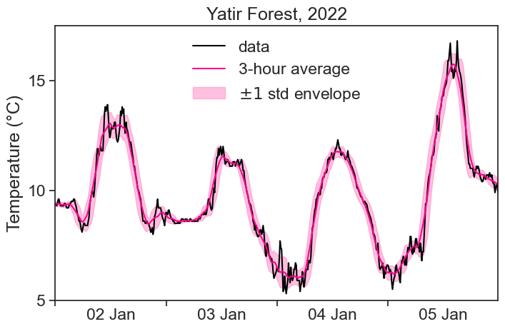
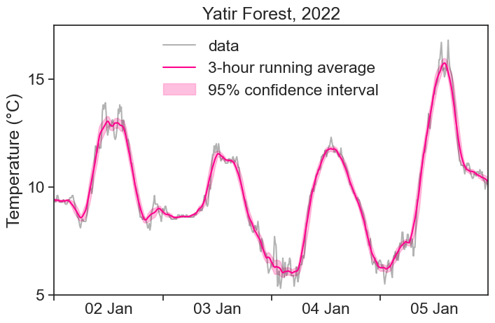
Let’s see on a graph the average temperature, with an envelope of 1 standard deviation around it:
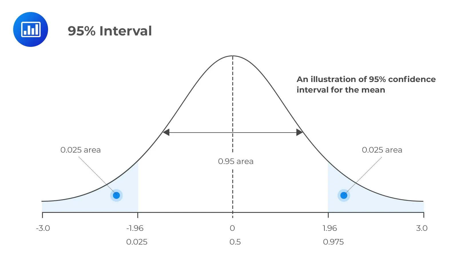
We can calculate anything we want inside the sliding window. One good example is the Confidence Interval of the Mean, given by:
CI(\alpha) = Z(\alpha) \cdot SE.
This is called “רווח בר-סֶמֶך” in hebrew.
Z(\alpha)= Z-score.
SE = standard error.
Z(\alpha) is the Z-score corresponding to the chosen confidence level \alpha. The most commonly used confidence level is 95%, which corresponds to a Z-score of 1.96. What does this mean? This means that we expect to find 95% of the points within \pm 1.96 standard deviations away from the mean.
You can find the Z-score using the following python code:
from scipy.stats import normconfidence_level =0.95# 5% outsideout =1- confidence_level# 0.975 of points to the left of right boundaryp =1- out/2# inverse of cdf: 0.975 of the points will be smaller than what distance (in sigma units)?z_score = norm.ppf(p)print(f"z-score = {z_score}")
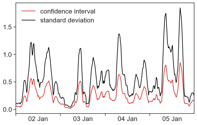
When the time series has a regular sampling frequency, all positions of the running window will have the same number of data points in them. Because the Confidence Interval is proportional to the Standard Error, and the SE is proportional to the Standard Deviation (\sqrt{N} is constant), then the envelope created by the CI is identical to the envelope created by the standard deviation, up to a multiplying constant. Nice.
CI and std
fig, ax = plt.subplots(figsize=(8,5))plot_ci, = ax.plot(df['confidence_int'], color='tab:red')plot_std, = ax.plot(df['std'], color="black")ax.legend([plot_ci, plot_std], ['confidence interval', 'standard deviation'], frameon=False)# applying the settings to the ax object# ax.set(**plot_settings)ax.set(xlim=[df.index[0], df.index[-1]])centered_dates(ax)