We will work together, running each cell in this Notebook step by step. Start by downloading the notebook (“Code” button above), and also download these 2 csv files:
If all you need is the average by years, then the most common way of writing the command would be in one single line:
df_world.groupby('year')['sst'].mean()
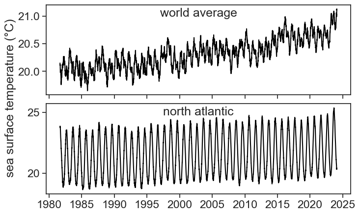
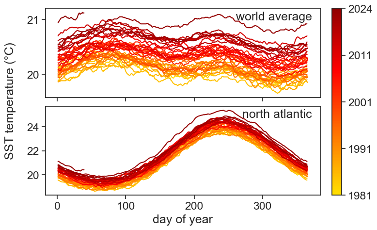
Let’s use groupby to plot world SST for all years, see how handy this method is. Also note that groupby return an object that can be iterated upon, as we do below.
fig, ax = plt.subplots()for year, data in gb_year_world: ax.plot(data['doy'], data['sst'], color="black")ax.set(xlabel="DOY", ylabel="SST");
With a few more lines of code we can make this look pretty.
Show the code
fig, ax = plt.subplots(2, 1, figsize=(8, 5), sharex=True)fig.subplots_adjust(hspace=0.1)# define the segment of the colormap to usestart, end =0.3, 0.8base_cmap = plt.cm.hot_rnew_colors = base_cmap(np.linspace(start, end, 256))new_cmap = mpl.colors.LinearSegmentedColormap.from_list("trunc({n},{a:.2f},{b:.2f})".format(n=base_cmap.name, a=start, b=end), new_colors)# defining the years for plottingyears = [year for year, _ in gb_year_world] + [year for year, _ in gb_year_north]min_year, max_year =min(years), max(years)# create a new normalization that matches the years to the new colormapnorm = mpl.colors.Normalize(vmin=min_year, vmax=max_year)# plotting the data with year-specific colors from the new colormapfor year, data in gb_year_world: ax[0].plot(data.index.day_of_year, data['sst'], color=new_cmap(norm(year)))for year, data in gb_year_north: ax[1].plot(data.index.day_of_year, data['sst'], color=new_cmap(norm(year)))# colorbar setupsm = mpl.cm.ScalarMappable(cmap=new_cmap, norm=norm)sm.set_array([])cbar = fig.colorbar(sm, ax=ax.ravel().tolist(), orientation='vertical', fraction=0.046, pad=0.04)ticks_years = [1981, 1991, 2001, 2011, 2024] # Specify years for colorbar tickscbar.set_ticks(np.linspace(min_year, max_year, num=len(ticks_years)))cbar.set_ticklabels(ticks_years)# adding shared ylabel and xlabelfig.text(0.02, 0.5, 'SST temperature (°C)', va='center', rotation='vertical')ax[1].set_xlabel("day of year")ax[0].text(0.97, 0.97, r"world average", transform=ax[0].transAxes, horizontalalignment='right', verticalalignment='top',)ax[1].text(0.97, 0.97, r"north atlantic", transform=ax[1].transAxes, horizontalalignment='right', verticalalignment='top',);
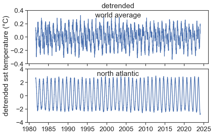
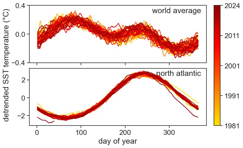
Now let’s do the same for the detrended SST:
Show the code
fig, ax = plt.subplots(2, 1, figsize=(8, 5), sharex=True)fig.subplots_adjust(hspace=0.1)# define the segment of the colormap to usestart, end =0.3, 0.8base_cmap = plt.cm.hot_rnew_colors = base_cmap(np.linspace(start, end, 256))new_cmap = mpl.colors.LinearSegmentedColormap.from_list("trunc({n},{a:.2f},{b:.2f})".format(n=base_cmap.name, a=start, b=end), new_colors)# defining the years for plottingyears = [year for year, _ in gb_year_world] + [year for year, _ in gb_year_north]min_year, max_year =min(years), max(years)# create a new normalization that matches the years to the new colormapnorm = mpl.colors.Normalize(vmin=min_year, vmax=max_year)# plotting the data with year-specific colors from the new colormapfor year, data in gb_year_world: ax[0].plot(data.index.day_of_year, data['detrended'], color=new_cmap(norm(year)))for year, data in gb_year_north: ax[1].plot(data.index.day_of_year, data['detrended'], color=new_cmap(norm(year)))# colorbar setupsm = mpl.cm.ScalarMappable(cmap=new_cmap, norm=norm)sm.set_array([])cbar = fig.colorbar(sm, ax=ax.ravel().tolist(), orientation='vertical', fraction=0.046, pad=0.04)ticks_years = [1981, 1991, 2001, 2011, 2024] # Specify years for colorbar tickscbar.set_ticks(np.linspace(min_year, max_year, num=len(ticks_years)))cbar.set_ticklabels(ticks_years)# adding shared ylabel and xlabelfig.text(0.02, 0.5, 'detrended SST temperature (°C)', va='center', rotation='vertical')ax[0].set(yticks=[-0.4,0,0.4])ax[1].set_xlabel("day of year")ax[0].text(0.97, 0.97, r"world average", transform=ax[0].transAxes, horizontalalignment='right', verticalalignment='top',)ax[1].text(0.97, 0.97, r"north atlantic", transform=ax[1].transAxes, horizontalalignment='right', verticalalignment='top',);
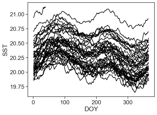
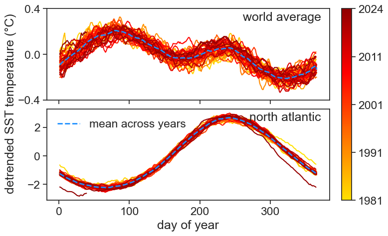
In order to determine what is the seasonal component, we need to calculate the average of the detrended data across all years. Again, groupby comes to rescue in a most elegant way:
Let’s incorporate the averages in the same graphs we saw above:
Show the code
fig, ax = plt.subplots(2, 1, figsize=(8, 5), sharex=True)fig.subplots_adjust(hspace=0.1)# define the segment of the colormap to usestart, end =0.3, 0.8base_cmap = plt.cm.hot_rnew_colors = base_cmap(np.linspace(start, end, 256))new_cmap = mpl.colors.LinearSegmentedColormap.from_list("trunc({n},{a:.2f},{b:.2f})".format(n=base_cmap.name, a=start, b=end), new_colors)# defining the years for plottingyears = [year for year, _ in gb_year_world] + [year for year, _ in gb_year_north]min_year, max_year =min(years), max(years)# create a new normalization that matches the years to the new colormapnorm = mpl.colors.Normalize(vmin=min_year, vmax=max_year)# plotting the data with year-specific colors from the new colormapfor year, data in gb_year_world: ax[0].plot(data.index.day_of_year, data['detrended'], color=new_cmap(norm(year)))for year, data in gb_year_north: ax[1].plot(data.index.day_of_year, data['detrended'], color=new_cmap(norm(year)))ax[0].plot(avg_world, color='dodgerblue', lw=2, ls='--')ax[1].plot(avg_north, color='dodgerblue', lw=2, ls='--', label="mean across years")ax[1].legend(loc="upper left", frameon=False)# colorbar setupsm = mpl.cm.ScalarMappable(cmap=new_cmap, norm=norm)sm.set_array([])cbar = fig.colorbar(sm, ax=ax.ravel().tolist(), orientation='vertical', fraction=0.046, pad=0.04)ticks_years = [1981, 1991, 2001, 2011, 2024] # Specify years for colorbar tickscbar.set_ticks(np.linspace(min_year, max_year, num=len(ticks_years)))cbar.set_ticklabels(ticks_years)# adding shared ylabel and xlabelfig.text(0.02, 0.5, 'detrended SST temperature (°C)', va='center', rotation='vertical')ax[0].set(yticks=[-0.4,0,0.4])ax[1].set_xlabel("day of year")ax[0].text(0.97, 0.97, r"world average", transform=ax[0].transAxes, horizontalalignment='right', verticalalignment='top',)ax[1].text(0.97, 0.97, r"north atlantic", transform=ax[1].transAxes, horizontalalignment='right', verticalalignment='top',);
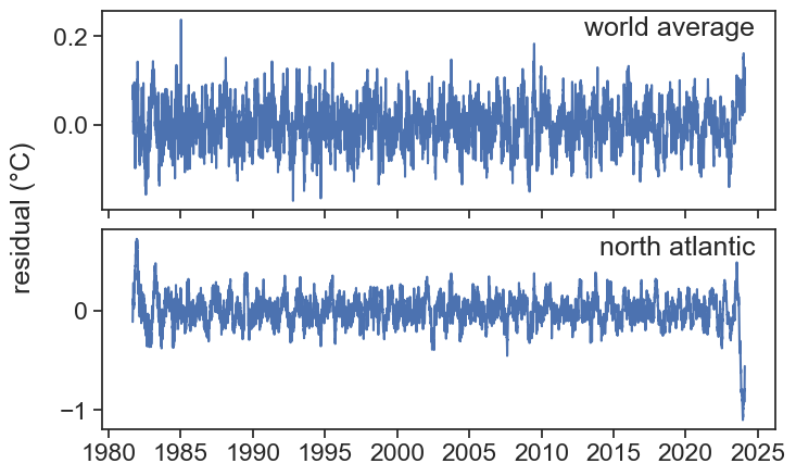
How do we know we have properly decomposed our signal into trend, seasonal and residual? The residual should be stationary. Let’s check using the ADF test:
Show the code
result = adfuller(df_world['resid'].dropna())print('World-average residual\nADF test p-value: ', result[1])result = adfuller(df_north['resid'].dropna())print('North-Atlantic residual\nADF test p-value: ', result[1])
World-average residual
ADF test p-value:  8.492905192092961e-26
North-Atlantic residual
ADF test p-value:  3.4138001038057293e-23
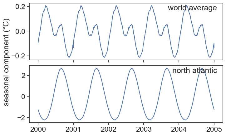
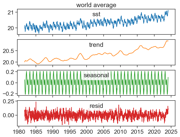
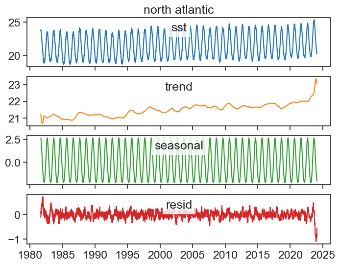
34.6 seasonal decomposition
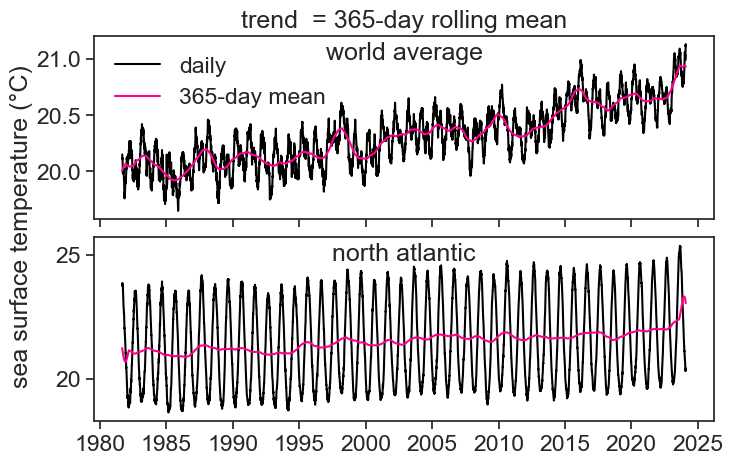
It is customary to plot each component in its own panel: