import numpy as npimport pandas as pdimport matplotlib.pyplot as plt
The three lines above are the most common way you will start every project in this course.
numpy = numerical python. This library has a ton useful mathematical functions, and most importantly, it has an object called numpy array, which is one of the most useful data structures we have for time series analysis.
pandas is built upon numpy, and allows us to easily manipulate data stored in dataframes, a fancy name for a table.
pyplot is a submodule of matplotlib, and allows us to beautifully plot data.
We will primarily use the Pandas package to deal with data. Pandas has become the standard Python tool to manipulate time series, and you should get acquainted with its basic usage. This course will provide you the opportunity to learn by example, but I’m sure we will only scratch the surface, and you’ll be left with lots of questions.
I provide below a (non-comprehensive) list of useful tutorials, they are a good reference for the beginner and for the experienced user.
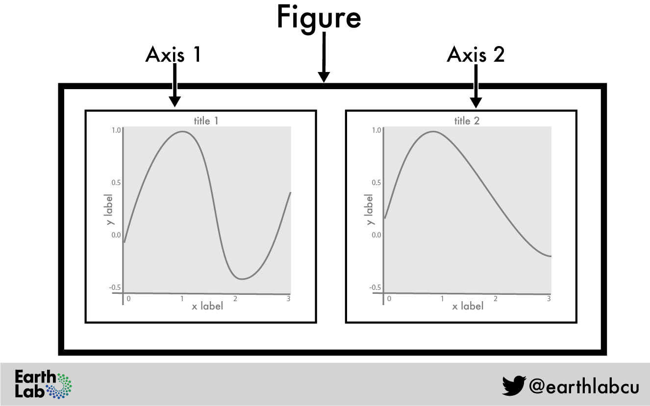
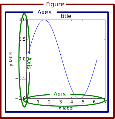
For the very beginners, you need to know that figure refers to the whole white canvas, and axes means the rectangle inside which something will be plotted:
The image above is good because it has 2 panels, and it’s easy to understand what going on. Sadly, they mixed the two terms, axis and axes.
axes is where the whole plot will be drawn. In the figure above it is the same as each panel.
axis is each of the vertical and horizontal lines, where you have ticks and numbers.
If you are new to all this, I recommend that you go to: