36  cross-correlation

import stuff
import numpy as np
import matplotlib.pyplot as plt
import matplotlib as mpl
import pandas as pd
from pandas.plotting import register_matplotlib_converters
register_matplotlib_converters()  # datetime converter for a matplotlib
import seaborn as sns
sns.set(style="ticks", font_scale=1.5)
import matplotlib.dates as mdates
from matplotlib.dates import DateFormatter
from datetime import datetime as dt
from scipy import signal
import math
import scipy
import statsmodels.api as sm

from ipywidgets import interact, IntSlider
from IPython.display import display, HTML


# %matplotlib widget
create synthetic data
delta_t = 0.1
time = np.arange(0, 50, delta_t)
N = len(time)
period = 10.0
time_offset = scipy.constants.golden
omega = math.tau / period
signal1 = 3.0 + np.sin(omega*time) + 0.1 * np.random.random(N)
signal2 = -0.5 + 0.2 * np.sin(omega*time - math.tau * (time_offset/period)) + 0.2 * np.random.random(N)
plot data
fig, ax = plt.subplots()
ax.plot(time, signal1, label="signal1")
ax.plot(time, signal2, label="signal2")
ax.set(xlabel="time",
       ylabel="signal")
ax.legend(frameon=False);

Let’s normalize our data:

x_n = \frac{x-\mu}{\sigma}.

This is identical to the Z-score we learned before. Effectively, our data now has zero mean and unit standard deviation.
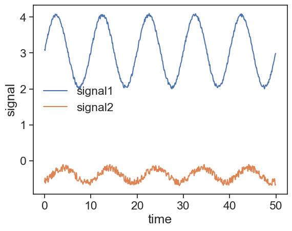
def norm_data(data):
    # normalize data to have mean=0 and standard_deviation=1
    return (data - data.mean())/ data.std()

s1 = norm_data(signal1)
s2 = norm_data(signal2)
plot normalized data
fig, ax = plt.subplots()
ax.plot(time, s1, label="normalized 1")
ax.plot(time, s2, label="normalized 2", zorder=0)
ax.set(xlabel="time",
       ylabel="signal")
ax.legend(frameon=False)

The definition of cross correlation is very similar to autocorrelation:

\rho_{XY}(\tau) = \frac{E\left[ (X_t - \mu)(Y_{t+\tau} - \mu) \right]}{\sigma_X \sigma_Y}

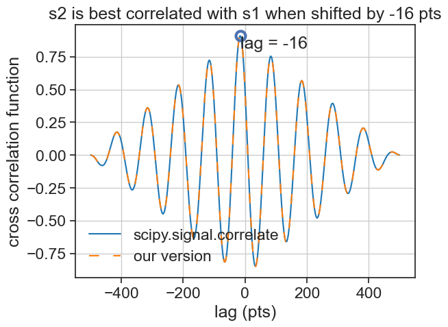
If the autocorrelation helps us check how similar a signal is to a lagged version of itself, the cross correlation measures how a signal X is similar to a lagged version of another signal Y.

Let’s write this ourselves:

def cross_corr(s1, s2):
    """
    we assume s1 and s2 to have the same length
    """
    N = len(s1)
    lags_left = np.arange(-(N-1), 1)
    lags_right = np.arange(1, N)
    cc_left = np.array( [np.sum(s2[-i:]*s1[:i]) for i in np.arange(1, len(lags_left)+1)] )
    cc_right = np.array( [np.sum(s2[:-i]*s1[i:]) for i in np.arange(1, len(lags_right)+1)] )
    lags = np.hstack([lags_left, lags_right])
    cc = np.hstack([cc_left, cc_right]) / N
    return lags, cc

Of course, there are available functions that accomplish the same, let’s compare them with our code:

cross correlation plot
corr_np = signal.correlate(s1, s2) / N
lags = signal.correlation_lags(len(s1), len(s2))

my_lag, my_cc = cross_corr(s1, s2)

max_index = np.argmax(corr_np)
fig, ax = plt.subplots()
ax.plot(lags, corr_np, color="tab:blue", label = "scipy.signal.correlate")
ax.plot(my_lag, my_cc, 'tab:orange', dashes=[7, 10], label = "our version")
ax.legend(loc="lower left", frameon=False)

ax.plot([lags[max_index]], [corr_np[max_index]], ls="None", marker="o", mfc="None", mew=3, ms=10)
ax.text(lags[max_index], corr_np[max_index],
        f"lag = {lags[max_index]}", va="top", ha="left")
ax.grid(True)
ax.set(xlabel="lag (pts)",
       ylabel="cross correlation function",
       title=f"s2 is best correlated with s1 when shifted by {lags[max_index]} pts");

prepare padded versions of the array
nann = np.zeros(N) * np.nan
s1_padded = np.hstack([nann, s1, nann])
N_padded = len(s1_padded)
lag_padded = np.arange(N_padded) - N
s2_padded = np.hstack([nann, nann, s2, nann, nann])
Widget, should work in VSCode, not on the website
# Define a function to plot the time series with a shift
def plot_time_series(shift=-500):
    sh = shift + N + 1
    fig, ax = plt.subplots(2, 1, figsize=(8, 6))
    fig.subplots_adjust(hspace=0.3)  # increase vertical space between panels
    ax[0].plot(lag_padded * delta_t, s1_padded, label="normalized 1")
    ax[0].plot(lag_padded * delta_t, s2_padded[2*N-sh:-sh], label="normalized 2", zorder=0)
    ax[0].set(xlabel="time",
           ylabel="normalized signal",
           xlim=[delta_t*lag_padded.min(), delta_t*lag_padded.max()])
    ax[1].plot(lags, corr_np, color="black", alpha=0.2)
    ax[1].plot(lags[:sh], corr_np[:sh], lw=3, color="xkcd:hot pink")
    ax[1].set(xlabel="lag (pts)",
           ylabel="CCF",
           xlim=[lags.min(), lags.max()],
           ylim=[-1,1])

    plt.show()

# Use interact to create the widget
interact(plot_time_series, shift=IntSlider(min=-500, max=499, step=1, value=-500))

# Add custom CSS to change the length of the slider
display(HTML("""
<style>
.widget-slider {
    width: 100%;
}
</style>
"""))