54 motivation
See below a graph of the Dead Sea level in the past decades?
- How fast is it going down on average?
- How fast does it change from month to month?
plot
fig, ax = plt.subplots(2, 1, figsize=(8,8), sharex=True)
ax[0].plot(df['level'], color="tab:blue")
ax[0].set(title="Dead Sea Level",
       ylabel="level (m)")
ax[1].plot(df['level'].diff())
ax[1].plot(df['level']*0, ls=":", color="gray")
ax[1].set(ylabel="diff of sea level")
plt.gcf().autofmt_xdate()  # makes slanted dates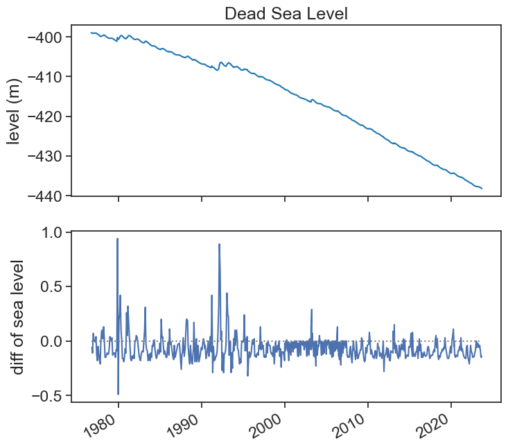
We suspect that the operation diff has something to do with derivatives, or rates of change.
- What exactly is this connection?
- What are (or should be) the units in the bottom graph?
- Should we care if data is evenly spaced in time?