46 filtering
Let’s say we have a signal with some noise that we want to filter out. How would we do that using Fourier transforms?
show signal and its power spectrum
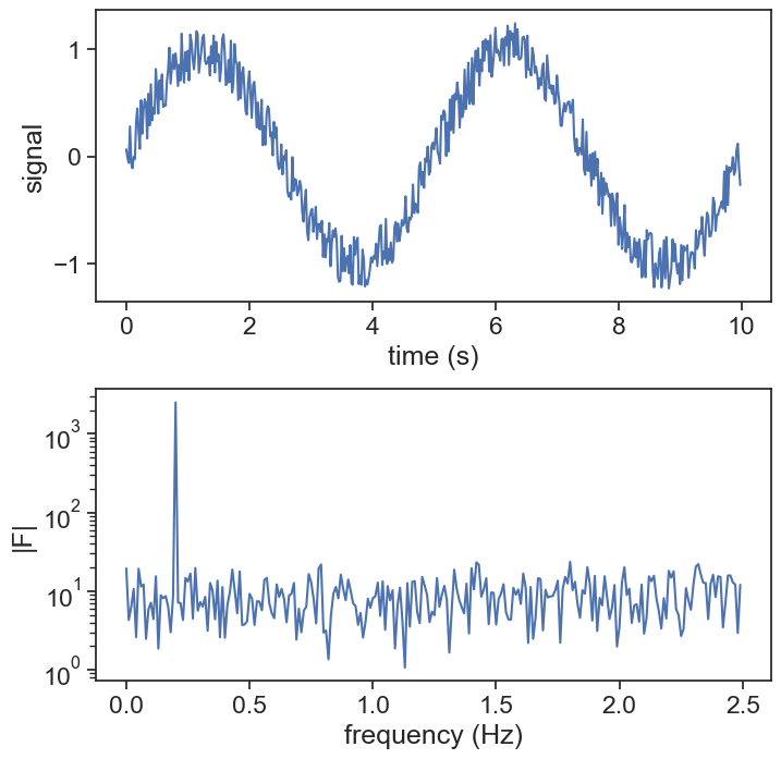
We can get rid of the fast variations in the signal by eliminating all high frequencies in the Fourier transform. The simplest way to do that is determining a cut-off frequency, and zeroing out the Fourier transform corresponding to frequencies higher than the cut off.
Also eliminate frequencies lower than negative cut off! This is important!
original vs. filtered
fig, ax = plt.subplots(2, 1, figsize=(8,8))
fig.subplots_adjust(hspace=0.30)
ax[0].plot(time[:N//10], signal[:N//10], color="tab:blue", label="original")
ax[0].plot(time[:N//10], signal_filtered[:N//10], color="tab:orange", lw=3, label="filtered")
ax[0].legend(frameon=False)
ax[0].set(xlabel="time (s)",
          ylabel="signal")

ax[1].plot(xi[:N//20], np.abs(fft[:N//20]))
ax[1].plot(xi[:N//20], np.abs(fft_filtered[:N//20]))

ax[1].set(xlabel="frequency (Hz)",
          ylabel="|F|");
ax[1].set_yscale('log');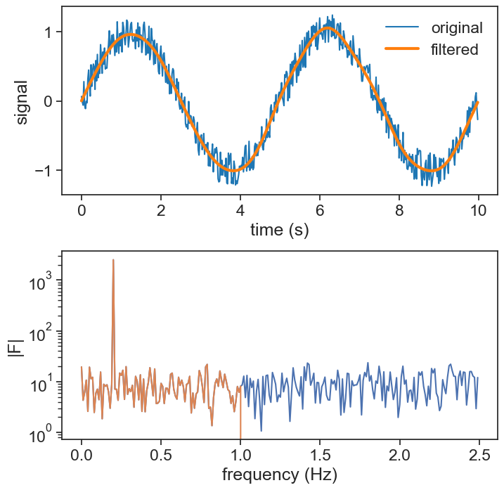
We applied above a “low pass” filter, because we let all the low frequencies pass, and eliminated the higher frequencies. Within signal processing, there are four primary types of filters commonly employed, each serving a unique purpose in shaping the signal’s characteristics.
Lowpass Filter: A lowpass filter allows signals with a frequency lower than a certain cutoff frequency to pass through while attenuating (reducing) the components of the signal that have frequencies higher than this cutoff frequency. It’s used to remove high-frequency noise or to extract the low-frequency components of a signal.
Highpass Filter: A highpass filter does the opposite of a lowpass filter. It allows signals with a frequency higher than a certain cutoff frequency to pass while attenuating signals with frequencies lower than the cutoff frequency. This type of filter is useful for removing low-frequency noise or to isolate high-frequency components.
Bandpass Filter: A bandpass filter allows signals within a certain frequency range (between a lower and an upper cutoff frequency) to pass through while attenuating signals outside this range. It’s used to isolate a specific frequency band from a broader spectrum of frequencies.
Bandstop Filter (Notch Filter): A bandstop filter, also known as a notch filter, attenuates signals within a specific frequency range while allowing signals outside this range to pass through relatively unaffected. This type of filter is useful for eliminating unwanted frequencies or noise from a signal without significantly affecting the other components of the signal.
ideal filter responses
fig, ax = plt.subplots(2, 2, figsize=(8,8), sharex=True, sharey=True)

fr = np.linspace(0,10,101)

plot_dict = {'lw':3, 'color':'tab:red'}

# panel (0,0)
cutoff_lp = 5.0
gain_lp = np.ones_like(fr)
mask = np.where(fr>cutoff_lp)
gain_lp[mask] = 0.0
ax[0,0].plot(fr, gain_lp, **plot_dict)
ax[0,0].text(2.5,1.05, "passband", ha="center", fontsize=14)
ax[0,0].text(7.5,1.05, "stop band", ha="center", fontsize=14)

# panel (0,1)
cutoff_hp = 5.0
gain_hp = np.ones_like(fr)
mask = np.where(fr<cutoff_hp)
gain_hp[mask] = 0.0
ax[0,1].plot(fr, gain_hp, **plot_dict)
ax[0,1].text(2.5,1.05, "stop band", ha="center", fontsize=14)
ax[0,1].text(7.5,1.05, "passband", ha="center", fontsize=14)

cutoff_1 = 4.0
cutoff_2 = 6.0
gain_bp = np.ones_like(fr)
mask = np.where( (fr<cutoff_1) | (fr>cutoff_2) )
gain_bp[mask] = 0.0
ax[1,0].plot(fr, gain_bp, **plot_dict)

gain_bs = np.ones_like(fr)
mask = np.where( (fr>cutoff_1) & (fr<cutoff_2) )
gain_bs[mask] = 0.0
ax[1,1].plot(fr, gain_bs, **plot_dict)

ax[0,0].set(ylabel="gain",
            ylim=[-0.1, 1.2],
            yticks=[0,1],
            xticks=[],
            title = "low pass")
ax[0,1].set(title = "high pass")
ax[1,0].set(ylabel="gain",
            xlabel="frequency",
            title = "band pass"
            )
ax[1,1].set(xlabel="frequency",
            title = "band stop"
            )

ax[0,0].spines[['right', 'top']].set_visible(False)
ax[0,1].spines[['right', 'top']].set_visible(False)
ax[1,0].spines[['right', 'top']].set_visible(False)
ax[1,1].spines[['right', 'top']].set_visible(False)
ax[0,0].grid()
ax[0,1].grid()
ax[1,0].grid()
ax[1,1].grid()

ax[0,0].annotate(
    "cut-off freq.",
    xy=(cutoff_lp+0.2, 0),  xycoords='data',
    xytext=(30, 40), textcoords='offset points',
    bbox=dict(boxstyle="round4,pad=.5", fc="white"),
    arrowprops=dict(arrowstyle="->",
                    color="black", lw=3,
                    connectionstyle="angle,angleA=0,angleB=60,rad=40"))

ax[0,1].annotate(
    "cut-off freq.",
    xy=(cutoff_hp+0.2, 0),  xycoords='data',
    xytext=(30, 40), textcoords='offset points',
    bbox=dict(boxstyle="round4,pad=.5", fc="white"),
    arrowprops=dict(arrowstyle="->",
                    color="black", lw=3,
                    connectionstyle="angle,angleA=0,angleB=60,rad=40"));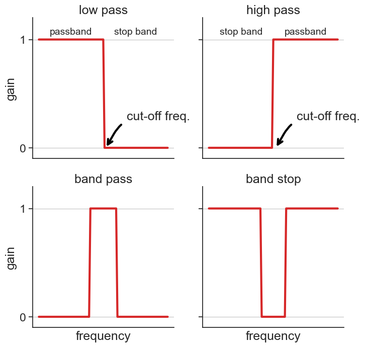
46.1 decibels
It is quite easy to apply a low pass filter as in the figure above, but that introduces problems down the road (more on that later). Usually, softer functions are used as filters, such as the ubiquitous first-order low pass frequency response:
\text{Gain} = \frac{1}{\sqrt{1+(\xi/\xi_c)^2}}
For example, this appears as the response of a simple RC electric circuit. Also, this is a particular instance of the Butterworth filter (order n=1).
first-order low pass filter, gain response
fig, ax = plt.subplots(1, 2, figsize=(8,4))

fr = np.linspace(0,5000,1001)
plot_dict = {'lw':3, 'color':'tab:red'}
cutoff_lp = 500.0
H = 1 / np.sqrt(1.0 + (fr/cutoff_lp)**2)
dB = 20.0 * np.log10(H)
ax[0].plot(fr, H, **plot_dict)
ax[0].set(xlim=[fr.min(), fr.max()],
          ylim=[0,1.1],
          yticks=[0,0.5,1.0],
          xlabel="freq (Hz)",
          ylabel="gain",
          title="linear-linear plot")
xlim_lin = ax[0].get_xlim()
ax[0].plot(xlim_lin, [1/np.sqrt(2)]*2, color="tab:blue")
ax[0].text(-100, 1/np.sqrt(2), r"$\frac{1}{\sqrt{2}}$", ha="right", color="tab:blue")
ax[0].text(cutoff_lp, 0.5/np.sqrt(2), "cut-off", rotation="vertical", ha="left", va="center")
ax[0].plot([cutoff_lp]*2, [0, 1/np.sqrt(2)], color="tab:gray", ls=":")
# ax[0].grid()


ax[1].plot(fr, dB, **plot_dict)
ax[1].set_xscale("log")
ax[1].yaxis.tick_right()
ax[1].yaxis.set_label_position("right")
ax[1].set(ylabel="power gain (dB)",
          xlabel="freq (Hz)",
          xlim=[1e-1,1e4],
          ylim=[-20,2],
          title="log-log plot")
# ax[1].grid()
xlim_log = ax[1].get_xlim()
ax[1].plot(xlim_log, [-3]*2, color="tab:blue")
ax[1].text(0.5, -3+0.2, "-3 dB", color="tab:blue")
ax[1].text(cutoff_lp, -10, "cut-off", rotation="vertical", ha="right", va="center")
ax[1].plot([cutoff_lp]*2, [-3, -30], color="tab:gray", ls=":")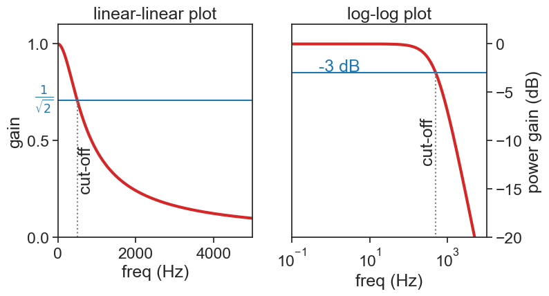
The cut-off frequency is roughly at the elbow in the graph on the right, and traditionally it is identified with a power gain of -3 dB. What does that mean?!
Decibels are defined as the following expression of two powers:
\text{dB} = 10\log_{10} \left( \frac{P}{P_0} \right),
where
- P is the power being measuered
- P_0 is a reference power level
Because powers are the square of the amplitude of a signal (let’s call this amplitude V), we can rewrite the definition as:
\text{dB} = 10\log_{10} \left( \frac{V^2}{V_0^2} \right) = 20\log_{10} \left( \frac{V}{V_0} \right),
The expression above is the famous one.
The cut-off frequency is usually considered that for which the ratio of powers drops to 1/2:
\frac{P}{P_0}=\frac{1}{2}\longrightarrow \left(\frac{V}{V_0}\right)^2=\frac{1}{2}\longrightarrow \frac{V}{V_0}=\frac{1}{\sqrt{2}}
That is the value that we see on the graph on the left. What about the value on the graph on the right? Let’s substitute \frac{P}{P_0}=\frac{1}{2} in the definition of the decibel:
\text{dB} = 10\log_{10} \left( \frac{1}{2} \right) \simeq -3,
Voilà! -3 dB is the value for the cut-off we see on the right!