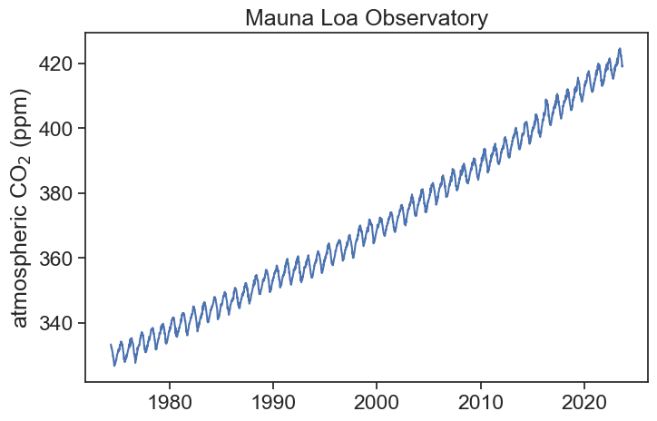
You might remember that even before this course started, I gave you an example of how to load data with pandas and how to plot it. Here we will be using the same data, namely, a time series for atmospheric CO_2 measured throughout the years in an obesevatory in Hawaii.
import stuff
import numpy as npimport matplotlib.pyplot as pltimport pandas as pdfrom pandas.plotting import register_matplotlib_convertersregister_matplotlib_converters() # datetime converter for a matplotlibimport seaborn as snssns.set(style="ticks", font_scale=1.5)from statsmodels.tsa.seasonal import seasonal_decomposeimport matplotlib.dates as mdatesfrom matplotlib.dates import DateFormatterfrom datetime import datetime as dtimport timefrom statsmodels.tsa.seasonal import seasonal_decomposefrom statsmodels.tsa.stattools import adfullerfrom statsmodels.tsa.seasonal import STL# %matplotlib widget
load csv and process data
url ="https://gml.noaa.gov/webdata/ccgg/trends/co2/co2_weekly_mlo.csv"# df = pd.read_csv(url, header=47, na_values=[-999.99])# you can first download, and then read the csvfilename ="co2_weekly_mlo.csv"df = pd.read_csv(filename, comment='#', # will ignore rows starting with # na_values=[-999.99] # substitute -999.99 for NaN (Not a Number), data not available )df['date'] = pd.to_datetime(df[['year', 'month', 'day']])df = df.set_index('date')# there are too many unnecessary columns, let's keep only co2 concentration (ppm)df = df['average'].to_frame().rename(columns={'average': 'co2'})# data comes in weekly frequency, let's make it daily and fill gaps with linear interpolationdf = df.resample('D').interpolate(method='linear')
plot
fig, ax = plt.subplots(figsize=(8,5))ax.plot(df['co2'])ax.set(ylabel=r'atmospheric CO$_2$(ppm)', title="Mauna Loa Observatory");
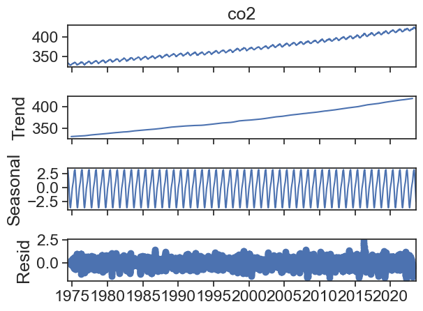
We can use statsmodels.tsa.seasonal.seasonal_decompose decompose this time series.
result = seasonal_decompose(df['co2'], period=365)result.plot();
The default plot is a bit ugly, we can make it better.
seasonal_decompose returns an object with four components:
observed: Y(t)
trend: T(t)
seasonal: S(t)
resid: e(t)
The default assumption is that the various components are summed together to produce the original observed time series:
Y(t) = T(t) + S(t) + e(t)
This is called the additive model of seasonal decomposition.
35.2 multiplicative model
seasonal_decompose returns an object with four components:
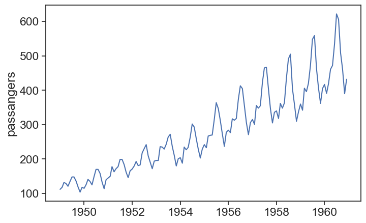
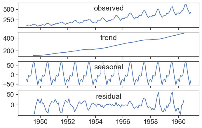
Not all time series seem to behave well when decomposed assuming an additive model. See, for instance, the famous time series for passengers of a US airline between 1949 to 1960.
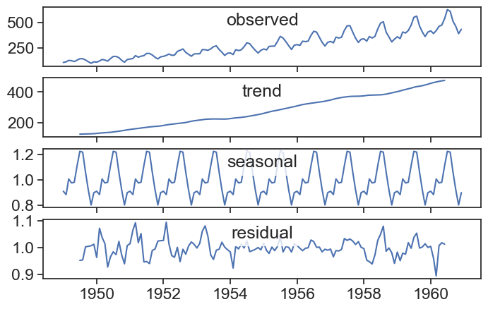
The residual is much larger at the beginning and at the end, and this is probably because the seasonal component increases with time. A good way to overcome this is to use the multiplicative model for seasonal decomposition:
Y(t) = T(t) \times S(t) \times e(t)
The components are now multiplied together to yield the observed time series. Let’s test it:
Show the code
result = seasonal_decompose(df_air['Passengers'], period=12, model="multiplicative")
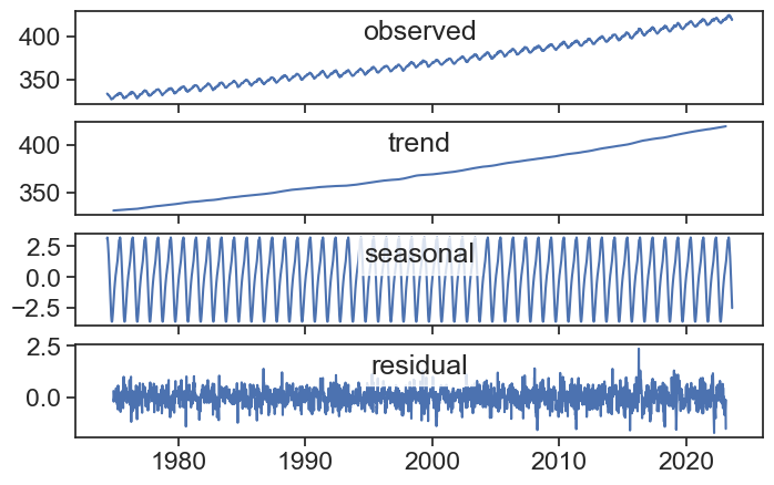
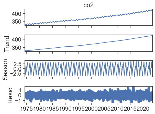
STL stands for “Seasonal and Trend decomposition using LOESS”. LOESS, in turn means “locally estimated scatterplot smoothing”, and it is a spiced up version of the Savitzky-Golay smoothing filter we saw earlier in this course. The method is not trivially understood as the naive seasonal decompostion we build together, and the full method is described by Cleveland et al. (1990)here. See in this video how the smoothing method works.
They the most striking difference with the plain seasonal decompose method is that the seasonal component is not constant in time, it can stlightly change and evolve over time.
Show the code
data = df['co2']res = STL(data, period=365).fit()res.plot();
A possible downside of STL is the fact that it assumes an additive model. If the seasonal oscillations in your data increase with the value of the series, then most probably a multiplicative model would be best for you. How to use STL then? One can take the logarithm of the series, since for a multiplicative model
Y(t) = T(t) \times S(t) \times e(t)
taking the logarithms yields
\log(Y) = \log(T) + \log(S) + \log(e).
We can now use STL since our model looks like additive now. After using STL, one can exponentiate the results to reverse the logarithm operation.
Cleveland, Robert B, William S Cleveland, Jean E McRae, and Irma Terpenning. 1990. “STL: A Seasonal-Trend Decomposition.”J. Off. Stat 6 (1): 3–73.