import numpy as npimport matplotlib.pyplot as pltimport matplotlib as mplimport pandas as pdimport aifcfrom pandas.plotting import register_matplotlib_convertersregister_matplotlib_converters() # datetime converter for a matplotlibimport seaborn as snssns.set(style="ticks", font_scale=1.5)import plotly.io as piopio.renderers.default ="plotly_mimetype+notebook_connected"import plotly.express as pximport plotly.graph_objects as gofrom plotly.subplots import make_subplotspio.templates.default ="presentation"import mathimport scipyfrom scipy.io import wavfile# %matplotlib widget
define useful functions
def open_aiff(filename): data = aifc.open(filename) Nframes = data.getnframes() str_signal = data.readframes(Nframes)# d = np.fromstring(str_signal, numpy.short).byteswap() d = np.frombuffer(str_signal, dtype=np.int16).byteswap()# if there are two channels, take only one of themif data.getnchannels() ==2: d = d[::2] N =len(d) dt =1.0/ data.getframerate() time = np.arange(N) * dtreturn time, ddef open_wav_return_fft(filename, max_freq=None): sample_rate, signal = wavfile.read(filename) time = np.arange(len(signal)) / sample_rate dt = time[1] - time[0] N =len(time) signal = normalize(signal) fft = scipy.fft.fft(signal) / N k = scipy.fft.fftfreq(N, dt) fft_abs = np.abs(fft)if max_freq ==None: max_freq = k.max() dk =1/ (time.max() - time.min()) n =int(max_freq/dk)return k[:n], fft_abs[:n]def normalize(signal):return (signal - signal.mean()) / signal.std()def fft_abs(signal, time, max_freq=None): dt = time[1] - time[0] N =len(time) fft = scipy.fft.fft(signal) / N k = scipy.fft.fftfreq(N, dt) fft_abs = np.abs(fft)if max_freq ==None: max_freq = k.max() dk =1/ (time.max() - time.min()) n =int(max_freq/dk)return k[:n], fft_abs[:n]
fig = make_subplots()fig.add_trace( go.Scatter(x=list(kA3), y=list(abs_fft_A3), name='piano A3', line=dict(color=color_A3), visible='legendonly'),)fig.add_trace( go.Scatter(x=list(kA4), y=list(abs_fft_A4), name='piano A4', line=dict(color=color_A4),),)fig.add_trace( go.Scatter(x=list(kB4), y=list(abs_fft_B4), name='piano B4', line=dict(color=color_B4), visible='legendonly'),)# Add range sliderfig.update_layout( title='3 notes on the piano', legend={"orientation":"h", # Horizontal legend"yanchor":"top", # Anchor legend to the top"y":1.1, # Adjust vertical position"xanchor":"center", # Anchor legend to the right"x":0.5, # Adjust horizontal position },)# Set y-axes titlesfig.update_yaxes( title_text="abs(FFT)",range=[-0.1,1])fig.update_xaxes( title_text="frequency (Hz)",)
We call the graph above a power spectrum. “Spectrum” refers to the frequencies, and “power” means that we square the signal. Strictly speaking, we see above the square root of the power spectrum, but I’ll still call it power spectrum.
The energy associated with a wave is proportional to the square of the wave’s amplitude. When we computed the fft of the signal, we divided it by N, which is akin to dividing by the whole time duration of the signal. For this reason we are dealing with power, which is energy / time. Finally, it should be noted that the square of a complex number z=a+ib is given by
|z|^2 = z\cdot z^*,
where z^*=a-ib is its complex conjugate:
z\cdot z^* = (a+ib)(a-ib) = a^2 + b^2.
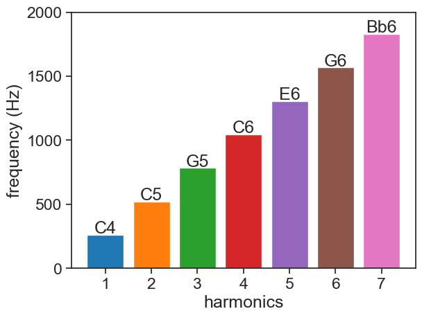
44.2 harmonics
Why do we see peaks at regular intervals in the power spectrum??
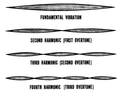
We call the lowest peak in the spectrum the fundamental frequency. Note that there are other high frequency peaks that follow the fundamental, at regular intervals. These are called overtones, and they are multiples of the fundamental frequency. The fundamental and the overtones are called together the harmonics.
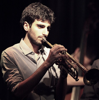
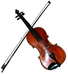
The sound produced by musical instruments is the outcome of vibrations in the body of the instrument. Often, these vibrations are standing waves, and that is the reason why we see such a strong overtone signature in the power spectrum.
fig = make_subplots()for i, instrument inenumerate(instrument_list): vis ='legendonly'if instrument =='piano': vis =True fig.add_trace( go.Scatter(x=list(k_list[i]), y=list(abs_fft_list[i]), name=f'{instrument}',# line=dict(color=color_A3), visible=vis#'legendonly' ), )# Add range sliderfig.update_layout(# title='3 notes on the piano', legend={"orientation":"h", # Horizontal legend"yanchor":"top", # Anchor legend to the top"y":1.1, # Adjust vertical position"xanchor":"center", # Anchor legend to the right"x":0.5, # Adjust horizontal position },)# Set y-axes titlesfig.update_yaxes( title_text="abs(FFT)",range=[-0.05,0.4])fig.update_xaxes( title_text="frequency (Hz)",)
This is a nice video about the connection between tibre and the harmonic series.
44.4 linear vs. logarithmic scale
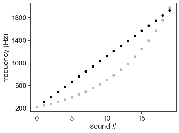
Listen to these two sequences of sounds.
1
2
See below a graph representing the sequence of frequencies for these two recordings. Which recording sounds more regular, like climbing steps of equal size?
Show the code
fr_linear = np.arange(220.0, 220.0+20*90, 90)alpha =2** (2.0/12)fr_exp = np.array( [220.0* alpha ** i for i inrange(20)] )fig, ax = plt.subplots()ax.plot(fr_linear, 'o', mfc="black", mec="None")ax.plot(fr_exp, 's', mfc=[0.7]*3, mec="None")ax.set(xlabel="sound #", ylabel="frequency (Hz)", yticks=np.arange(200,2001,400))pass
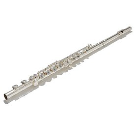
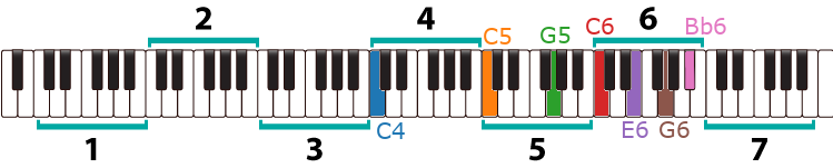
Probably, the most common tuning standard in western music is A440, meaning that the note corresponding to the A4 on the piano must have a fundamental frequency equal to 440 Hz. Go to the graph shown in power spectrum , zoom in, and find out if the piano was “properly” tuned.
The A3 note has its fundamental frequency at half of that, namely 220 Hz.
Because there are 12 half-steps between A3 and A4, can you figure out a rule how to find the frequency of any note on the piano?
Dividing an octave in 12 equal half-steps is called “equal temperament”. Multiplying the A3 frequency 12 times by an unknown factor y should give us the frequency of A4:
Our pitch perception is logarithmic, meaning that when we hear a string of frequencies that increase exponentially, we percieve it as increasing with regular steps. Sound 2 corresponds to the exponential orange dots.

.jpg)