50 practice 3
Here we will find the tempo of a song.
First let’s listen to the song:
Link to the full song on youtube.
Import audio timeseries
Standardize and plot.
audio = (audio - np.mean(audio))/np.std(audio)
length = audio.shape[0] / samplerate
time = np.linspace(0., length, audio.shape[0])

fig, ax = plt.subplots()
ax.plot(time, audio)
ax.set_xlabel("Time (s)")
ax.set_ylabel("Amplitude")

plt.tight_layout()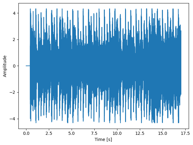
Let’s see what is the sample rate of the song, that is, how many data points we have per second.
50.1 apply FFT
keep only positive k values
fig, ax = plt.subplots()
ax.plot(k, fft_abs)
ax.set(xlabel="k (Hz)",
       ylabel="$|F|$",
       title="sqrt of power spectrum of $x(t)$");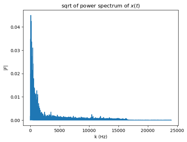
The relevant frequency spectrum for tempo is very low in the 0.5-6 Hz range. Think about it, a clock ticks at 1 Hz, that will be like a slow song. Double that speed will be 2 Hz. Actually, in the music world we don’t talk in Hz when dealing with tempo, we use beats per minute (bpm) instead. A clock ticks at 60 bpm, a song double that speed will be at 120 bpm. The conversion factor from Hz to bpm is simple, 1Hz = 60 bpm. So let’s zoom in to that range:
bpm = k*60
fig, ax = plt.subplots()
ax.plot(bpm, fft_abs)
ax.set(xlabel="pbm",
       ylabel="$|F|$",
       title="sqrt of power spectrum of $x(t)$");
ax.set_xlim(-100,600);
ax.set_ylim(-0.0001,0.002);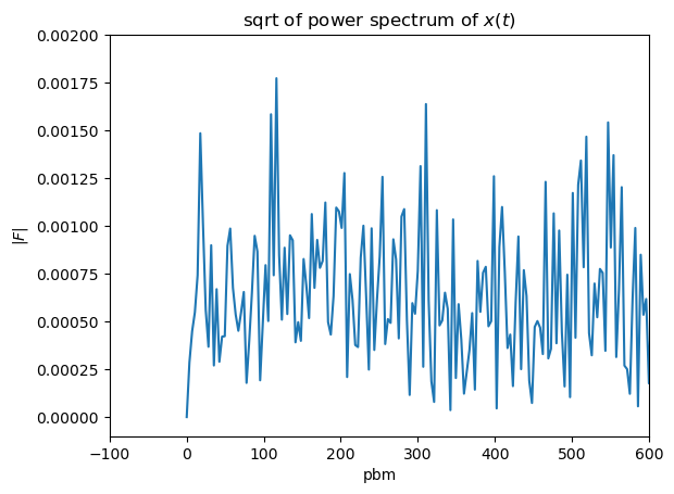
We don’t see any significant peak. That is because the samplerate is very high and it is picking on the actual notes that are being played at every beat making the peak not clear. Lets filter the timeseries to show the beat peaks more clearly. We will do that by resampling the max values of stagered pools of values.
factor = 200
data_reshaped = audio.reshape(int(len(audio)/factor), factor)
max_values = np.max(data_reshaped, axis=1)
max_values = (max_values - np.mean(max_values))/np.std(max_values)
new_samplerate = samplerate/factor
N = max_values.shape[0]
new_length = N / new_samplerate
new_time = np.linspace(0., new_length, N)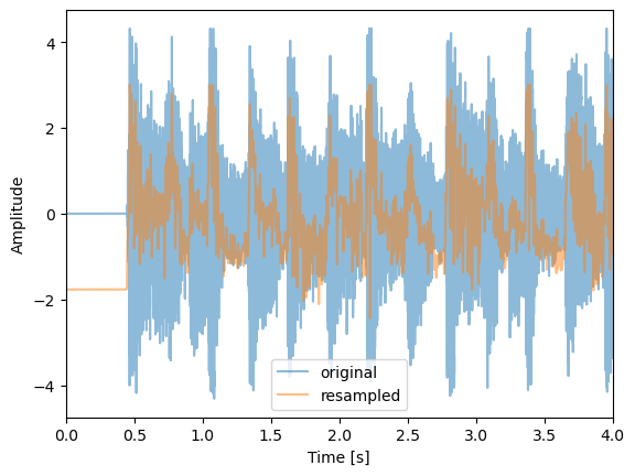
50.2 Apply FFT on resampled timeseries
bpm = k*60
fig, ax = plt.subplots()
ax.plot(bpm, fft_abs)
ax.set(xlabel="bpm",
       ylabel="$|F|$",
       title=r"sqrt of power spectrum of $x(t)$");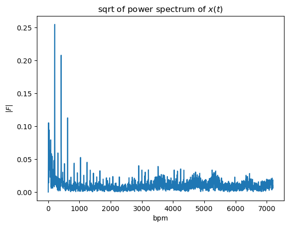
Lets zoom into the relevant range:
bpm = k*60
fig, ax = plt.subplots()
ax.plot(bpm, fft_abs)
ax.set(xlabel="bpm",
       ylabel="$|F|$",
       title=r"sqrt of power spectrum of $x(t)$");
ax.set_xlim(-100,600);
print(f'Highest peak at {bpm[fft_abs.argmax()]:.2f} bpm')
Highest peak at 208.24 bpm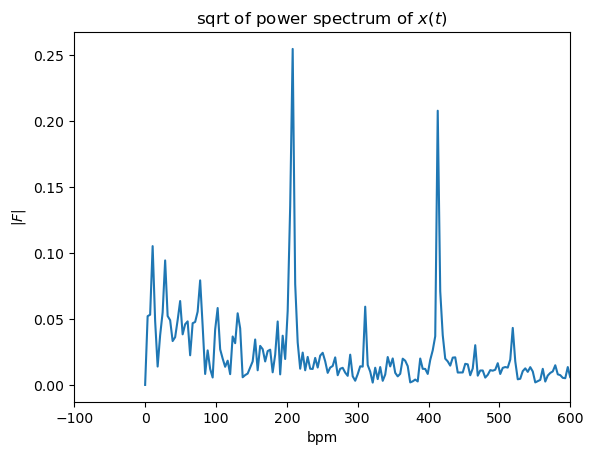
We got a strong peak on 208.24 pbm.
Let’s check what is the “agreed” bpm of the song, we will do it in two ways:
- google search: stayin alive bpm
- using the site bpmfinder that computes the pbm for a given youtube link. They don’t use fft, you can read about their method here.