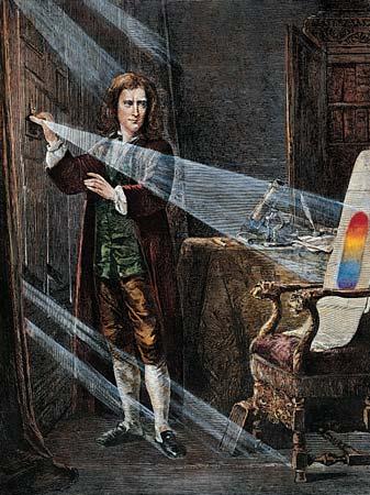
In the 17th century, Isaac Newton studied how white light can be decomposed into the colors of the rainbow. He called the decomposed colors “spectrum”, after the latin word for image. Later, the word spectrum started to be used in other contexts involving a range of frequencies, even when not related to light or colors.
The Discrete Fourier Transform helps us decompose a discrete time series into a list of (complex) weights for a range of frequencies, or spectrum. Its formula is given by
F_k = \sum_{n=0}^{N-1} x_n e^{-2\pi i k\frac{n}{N}},
where F_k is the array representing the Fourier transform F(\xi), and x_n is the array representing the time series f(t). All the information contained in f(t) is fully preserved in F(\xi).
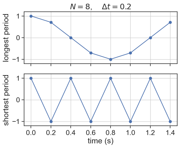
What are the lowest and highest frequencies that can be measured?
import stuff
import numpy as npimport matplotlib.pyplot as pltimport matplotlib as mplimport pandas as pdfrom pandas.plotting import register_matplotlib_convertersregister_matplotlib_converters() # datetime converter for a matplotlibimport seaborn as snssns.set(style="ticks", font_scale=1.5)import matplotlib.gridspec as gridspecimport mathimport scipy# %matplotlib widget
The longest possible period that we can measure is the length of the time series itself:
T_\text{long} = N\times \Delta t
The shortest possible period is twice the time resolution:
T_\text{short} = 2\times \Delta t
Let’s translate this into frequency. Because frequency is the inverse of period (\xi = \frac{1}{T}), the smallest possible frequency is the inverse of the longest possible period, and vice versa.
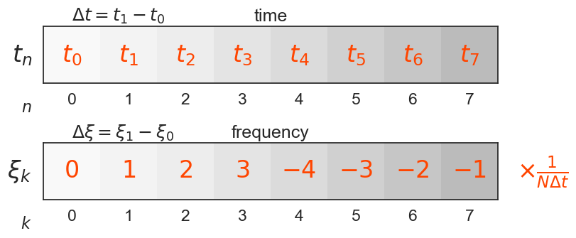
There is a duality between the variables time (t) and frequency (\xi). It is important to understand how to convert from one the the other in the context of DFTs:
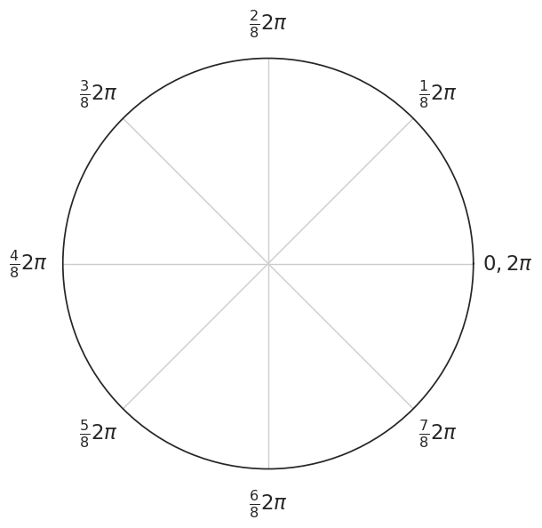
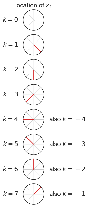
Why is there such a weird pattern for \xi, where first we have the positive values, and after that the negative? Let’s see again the equation for the DFT:
F_k = \sum_{n=0}^{N-1} x_n e^{-2\pi i k\frac{n}{N}},
What happens to the location of x_1 as we increase the index k?
Show the code
fig, ax = plt.subplots(1, figsize=(6, 6), subplot_kw=dict(polar=True))N =8k = np.arange(8)angles =2.0* np.pi * k *1/ N # for i in range(N):# ax[i].plot([theta[i]]*2, [0, 1], lw=2, color="tab:red")# stems = ax.stem(theta, r)# for artist in stems.get_children():# artist.set_clip_on(False)theta_ticks =2.0*np.pi * np.arange(8)/8theta_tick_labels = [r"$0,2\pi$",r"$\frac{1}{8}2\pi$",r"$\frac{2}{8}2\pi$",r"$\frac{3}{8}2\pi$",r"$\frac{4}{8}2\pi$",r"$\frac{5}{8}2\pi$",r"$\frac{6}{8}2\pi$",r"$\frac{7}{8}2\pi$", ]ax.set(yticks=[], xticks=theta_ticks, xticklabels=theta_tick_labels, ylim=(0, 1))# # ax.set_xticks(theta_ticks, theta_tick_labels, pad=10)ax.tick_params(axis='x', which='major', pad=15)# ax.grid(False)# # ax.set_clip_on(False)
Show the code
N =8r = [1] * Nk = np.arange(8)theta =-2.0* np.pi * k *1/ N #np.arange(1,N+1) * 2.0 * np.pi / Nfig, ax = plt.subplots(N, 1, figsize=(30, 10), subplot_kw=dict(polar=True))for i inrange(N): ax[i].plot([theta[i]]*2, [0, 1], lw=2, color="tab:red") ax[i].set(yticks=[], xticks=theta_ticks, xticklabels=[], ylim=(0, 1)) ax[i].text(np.pi, 1.5, fr"$k={i}$", ha="right", va="center")ax[0].set(title=r"location of $x_1$")for i inrange(4,8): ax[i].text(0, 1.5, fr"also $k={i-8}$", ha="left", va="center")# stems = ax.stem(theta, r)# for artist in stems.get_children():# artist.set_clip_on(False)# theta_ticks = 2.0*np.pi * np.arange(8)/8# theta_tick_labels = [r"$0,2\pi$",# r"$\frac{1}{8}2\pi$",# r"$\frac{2}{8}2\pi$",# r"$\frac{3}{8}2\pi$",# r"$\frac{4}{8}2\pi$",# r"$\frac{5}{8}2\pi$",# r"$\frac{6}{8}2\pi$",# r"$\frac{7}{8}2\pi$",# ]# # ax.set_xticks(theta_ticks, theta_tick_labels, pad=10)# ax.tick_params(axis='x', which='major', pad=15)# ax.grid(False)# # ax.set_clip_on(False)
We saw above that when sampling at a \Delta t, the shortest possible period is 2\Delta t. This is the Nyquist rate.
Theorem
If a system uniformly samples an analog signal at a rate that exceeds the signal’s highest frequency by at least a factor of two, the original analog signal can be perfectly recovered from the discrete values produced by sampling.
Conversely, we can negate the statement above, saying that:
If we sample an analog signal at a frequency that is lower than the Nyquist rate, we will not be able to perfectly reconstruct the original signal.
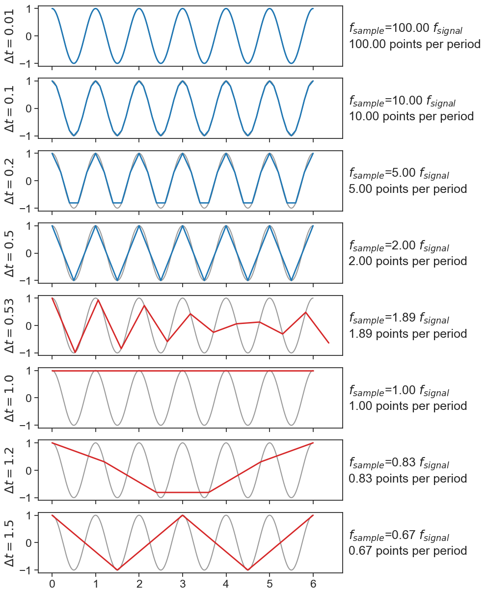
As an example, let’s sample a cosine wave whose frequency is 1 Hz at various sampling rates.
Show the code
dt_list = [0.01, 0.1, 0.2, 0.5, 0.53, 1.0, 1.2, 1.5]fig, ax = plt.subplots(len(dt_list), 1, figsize=(8, 15), sharex=True)T_total =6.0# secondsfunc =lambda t: np.cos(2.0* np.pi * t)t_high = np.arange(0, T_total, 0.001)signal = func(t_high)for i, dt inenumerate(dt_list): time = np.arange(0, T_total+dt, dt) ax[i].plot(t_high, signal, color="black", alpha=0.4) c ="tab:blue"if dt >0.5: c ="tab:red" ax[i].plot(time, func(time), lw=2, color=c) ax[i].set(ylabel=fr"$\Delta t = {dt}$") text =r"$f_{sample}$"+rf"={1/dt:.2f}"+r" $f_{signal}$"+f"\n{1/dt:.2f} points per period" ax[i].text(1.02, 0.50, text, transform=ax[i].transAxes, horizontalalignment='left', verticalalignment='center',)
Sampling at a \Delta t greater than 0.5 exemplifies a phenomenon called aliasing.