55 finite differences
Definition of a derivative:
\underbrace{\dot{f} = f'(t) = \frac{d}{dt}f(t) = \frac{df(t)}{dt}}_{\text{same thing}} = \lim_{\Delta t \rightarrow 0} \frac{f(t+\Delta t) - f(t)}{\Delta t}
Numerically, we can approximate the derivative f'(t) of a time series f(t) as
\frac{d}{dt}f(t) = \frac{f(t+\Delta t) - f(t)}{\Delta t} + \mathcal{O}(\Delta t). \tag{55.1}
The expression \mathcal{O}(\Delta t) means that the error associated with the approximation is proportional to \Delta t. This is called “Big O notation”.
The expression above is called the two-point forward difference formula.
forward difference plot
t = np.linspace(0,10,101)
def f(t):
    """
    function to plot
    """
    return t**3+t**2

def ftag(t):
    """
    derivative
    """
    return 3*t**2 +2*t

def line_chord(p1, p2, t):
    """
    given two points p1 and p2, return equation for the line that connects between them
    """
    p1x, p1y = p1
    p2x, p2y = p2
    slope = (p1y-p2y) / (p1x-p2x)
    intercept = (p1x*p2y - p1y*p2x) / (p1x-p2x)
    return slope*t + intercept

def line_tangent(p1, slope, t):
    """
    return equation of the line that passes through p1 with slope "slope"
    """
    p1x, p1y = p1
    intercept = p1y - slope*p1x
    return slope*t + intercept

x1 = 6.0
y1 = f(x1)
x2 = 8.0
y2 = f(x2)
chord = line_chord((x1,y1), (x2,y2), t)
tangent = line_tangent((x1,y1), ftag(x1), t)

fig, ax = plt.subplots(1, 1, figsize=(8,6))
ax.plot(t, f(t), lw=2, color="black")
ax.plot(t, tangent, color="tab:blue", lw=2, label="derivative")
ax.plot(t, chord, color="tab:orange", lw=2, label="approximation")
ax.legend(frameon=False)

ax.set(xlim=[3, 9],
       ylim=[-10,700],
       ylabel=r"$f(t)$",
       xticks=[6,8],
       yticks=[],
       xticklabels=[r'$t$', r'$t+\Delta t$'],
       title="forward difference");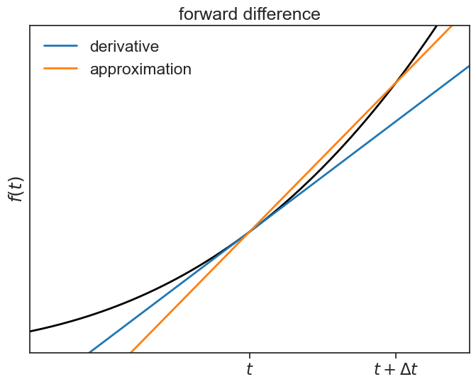
Likewise, we can define the two-point backward difference formula:
\frac{df(t)}{dt} = \frac{f(t) - f(t-\Delta t)}{\Delta t} + \mathcal{O}(\Delta t). \tag{55.2}
backward difference plot
x0 = 4.0
y0 = f(x0)
chord2 = line_chord((x1,y1), (x0,y0), t)

fig, ax = plt.subplots(1, 1, figsize=(8,6))
ax.plot(t, f(t), lw=2, color="black")
ax.plot(t, tangent, color="tab:blue", lw=2, label="derivative")
ax.plot(t, chord2, color="tab:orange", lw=2, label="approximation")
ax.legend(frameon=False)

ax.set(xlim=[3, 9],
       ylim=[-10,700],
       ylabel=r"$f(t)$",
       xticks=[4,6],
       yticks=[],
       xticklabels=[r'$t-\Delta t$', r'$t$'],
       title="backward difference");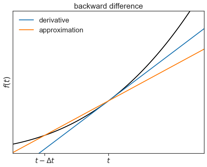
If we sum together Equation 55.1 and Equation 55.2 we get:
\begin{aligned} 2\frac{df(t)}{dt} &= \frac{f(t+\Delta t) - \cancel{f(t)}}{\Delta t} + \frac{\cancel{f(t)} - f(t-\Delta t)}{\Delta t} \\ &= \frac{f(t+\Delta t) - f(t-\Delta t)}{\Delta t}. \end{aligned} \tag{55.3}
Dividing both sides by 2 gives the two-point central difference formula:
\frac{df(t)}{dt} = \frac{f(t+\Delta t) - f(t-\Delta t)}{2\Delta t} + \mathcal{O}(\Delta t^2). \tag{55.4}
backward difference plot
chord3 = line_chord((x2,y2), (x0,y0), t)

fig, ax = plt.subplots(1, 1, figsize=(8,6))
ax.plot(t, f(t), lw=2, color="black")
ax.plot(t, tangent, color="tab:blue", lw=2, label="derivative")
ax.plot(t, chord3, color="tab:orange", lw=2, label="approximation")
ax.legend(frameon=False)

ax.set(xlim=[3, 9],
       ylim=[-10,700],
       ylabel=r"$f(t)$",
       xticks=[4,6,8],
       yticks=[],
       xticklabels=[r'$t-\Delta t$', r'$t$', r'$t+\Delta t$'],
       title="central difference");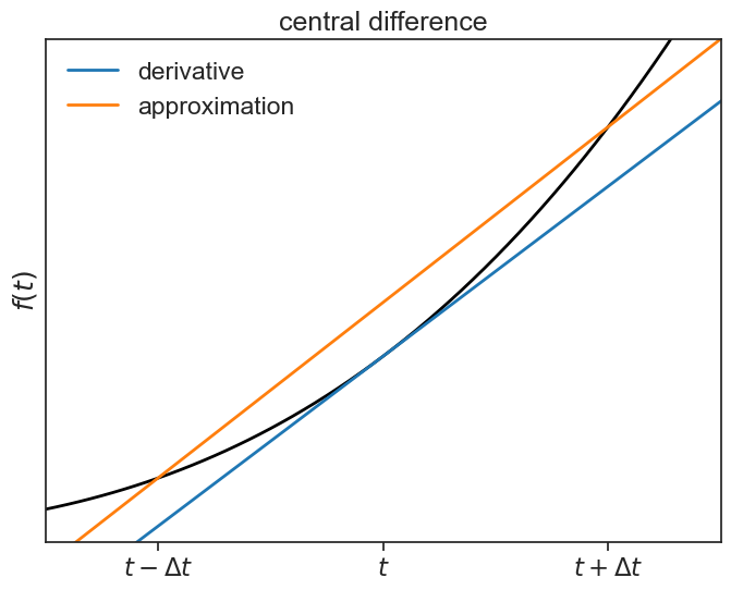
Let’s compare these three methods. For which of them the slope of the orange line is closer to the actual derivative (blue)?
compare the 3 methods
fig, ax = plt.subplots(1, 3, figsize=(8,3), sharex=True, sharey=True)

ax[0].plot(t, f(t), lw=2, color="black", label=r"$f(t)$")
ax[0].plot(t, tangent, color="tab:blue", lw=2, label=r"derivative at $t$")
ax[0].plot(t, chord, color="tab:orange", lw=2, label="approximation")
ax[0].legend(loc="upper left", bbox_to_anchor=(0.0,-0.2), frameon=False)

ax[1].plot(t, f(t), lw=2, color="black")
ax[1].plot(t, tangent, color="tab:blue", lw=2, label="derivative")
ax[1].plot(t, chord2, color="tab:orange", lw=2, label="approximation")

ax[2].plot(t, f(t), lw=2, color="black")
ax[2].plot(t, tangent, color="tab:blue", lw=2, label="derivative")
ax[2].plot(t, chord3, color="tab:orange", lw=2, label="approximation")

ax[0].set(title="forward\ndifference",
          ylabel=r"$f(t)$",);
ax[1].set(title="backward\ndifference");

ax[2].set(xlim=[3, 9],
       ylim=[-10,700],
       xticks=[4,6,8],
       yticks=[],
       xticklabels=[r'$t-\Delta t$', r'$t$', r'$t+\Delta t$'],
       title="central\ndifference");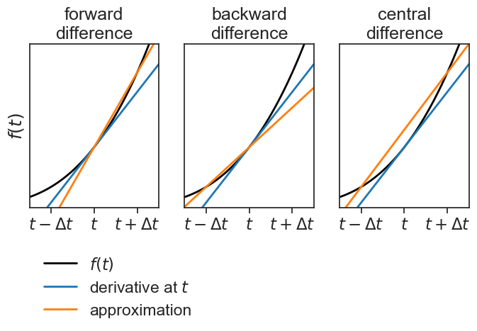
Two things are worth mentioning about the approximation above:
- it is balanced, that is, there is no preference of the future over the past.
- its error is proportional to \Delta t^2, it is a lot more precise than the unbalanced approximations :)
To understand why the error is proportional to \Delta t^2, one can subtract the Taylor expansion of f(t-\Delta t) from the Taylor expansion of f(t+\Delta t). See this, pages 3 and 4.
The function np.gradient calculates the derivative using the central difference for points in the interior of the array, and uses the forward (backward) difference for the derivative at the beginning (end) of the array.
The “gradient” usually refers to a first derivative with respect to space, and it is denoted as \nabla f(x)=\frac{df(x)}{dx}. However, it doesn’t really matter if we call the independent variable x or t, the derivative operator is exactly the same.
Check out this nice example.
55.1 dead sea level
load data and plot
filename = "../archive/data/dead_sea_level.csv"
df = pd.read_csv(filename)
df['date'] = pd.to_datetime(df['date'], dayfirst=True)
df = df.set_index('date').sort_values(by='date')

fig, ax = plt.subplots(2, 1, figsize=(8,8))
fig.subplots_adjust(hspace=0.2)
ax[0].plot(df['level'], '-o', color="tab:blue",)
ax[0].set(title="uneven sampling intervals",
          ylabel="level (m)")
locator = mdates.AutoDateLocator(minticks=5, maxticks=9)
formatter = mdates.ConciseDateFormatter(locator)
ax[0].xaxis.set_major_locator(locator)
ax[0].xaxis.set_major_formatter(formatter)

locator = mdates.AutoDateLocator(minticks=5, maxticks=9)
formatter = mdates.ConciseDateFormatter(locator)
ax[1].plot(df.loc['2021-02-01':'2022-12-01', 'level'], 'o', color="tab:blue", mfc="None")
ax[1].xaxis.set_major_locator(locator)
ax[1].xaxis.set_major_formatter(formatter)
ax[1].set(ylabel="level (m)");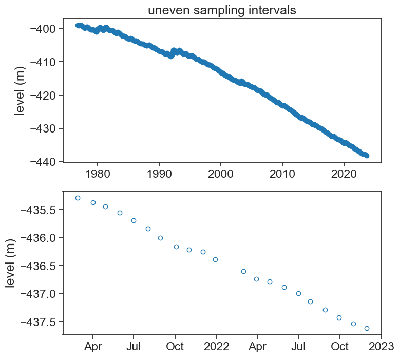
Show the code
df2 = df['level'].resample('D').interpolate('time').to_frame()
df2['level_smooth'] = df2['level'].rolling('30D', center=True).mean()
dt = 1.0 # day
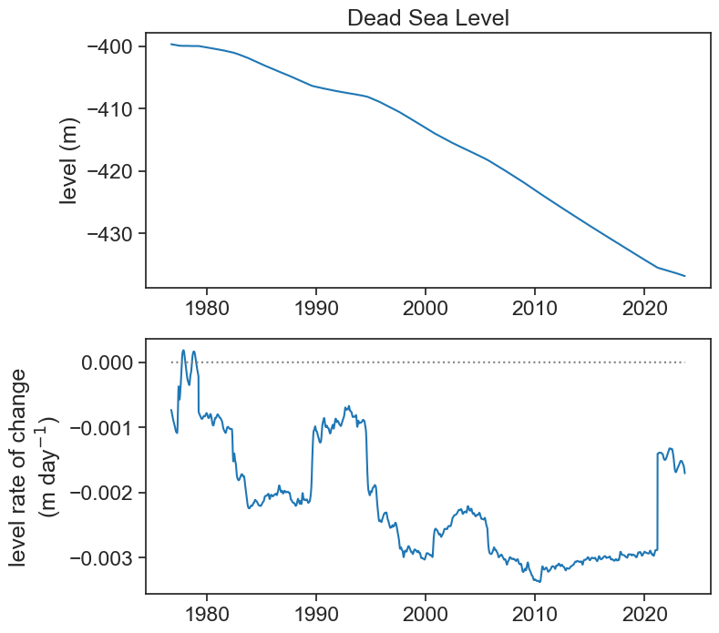
df2['grad'] = np.gradient(df2['level_smooth'].values, dt)
fig, ax = plt.subplots(2, 1, figsize=(8,8))
fig.subplots_adjust(hspace=0.2)
ax[0].plot(df2['level_smooth'], color="tab:blue",)
ax[0].set(title="Dead Sea Level",
ylabel="level (m)")
ax[1].plot(df2['grad'], color="tab:blue")
ax[1].plot(df2['grad']*0, color="gray", ls=":")
ax[1].set(ylabel="level rate of change\n"+r"(m day$^{-1}$)")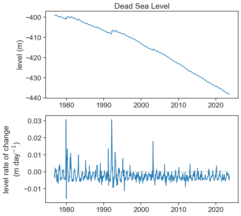
If this is too noisy to your taste, and you are looking for rates of change for longer time scales (e.g., a year), then we can smooth the original signal. First let’s smooth it by applying a running average of width 365 days.
Show the code
df2['level_smooth_yr'] = df2['level_smooth'].rolling('365D', center=True).mean()
dt = 1.0 # day
df2['grad_yr'] = np.gradient(df2['level_smooth_yr'].values, dt)

fig, ax = plt.subplots(2, 1, figsize=(8,8))
fig.subplots_adjust(hspace=0.2)
ax[0].plot(df2['level_smooth_yr'], color="tab:blue",)
ax[0].set(title="Dead Sea Level",
          ylabel="level (m)")
ax[1].plot(df2['grad_yr'], color="tab:blue")
ax[1].plot(df2['grad_yr']*0, color="gray", ls=":")
ax[1].set(ylabel="level rate of change\n"+r"(m day$^{-1}$)");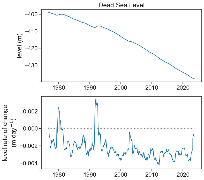
Let’s see now with a 5-year window.
Show the code
df2['level_smooth_5yr'] = df2['level_smooth'].rolling('1825D', center=True).mean()
dt = 1.0 # day
df2['grad_5yr'] = np.gradient(df2['level_smooth_5yr'].values, dt)

fig, ax = plt.subplots(2, 1, figsize=(8,8))
fig.subplots_adjust(hspace=0.2)
ax[0].plot(df2['level_smooth_5yr'], color="tab:blue",)
ax[0].set(title="Dead Sea Level",
          ylabel="level (m)")
ax[1].plot(df2['grad_5yr'], color="tab:blue")
ax[1].plot(df2['grad_5yr']*0, color="gray", ls=":")
ax[1].set(ylabel="level rate of change\n"+r"(m day$^{-1}$)");