52 bias-variance tradeoff
Let’s say I’m running an experiment where I observe some data points (x, y). This experiment could represent whatever you like, but I always like to have a concrete example in mind. Assume that x is the number of years a person has gone to school/university, and y is their income. The process that generates this data has a true underlying function f(x), but I don’t know what it is. What’s worse, nature is noisy, so the observed data points y are not exactly on the true function, but are spread around it:
y = f(x) + \epsilon.
Here the noise \epsilon has zero mean and some standard deviation \sigma. In our example, the noise could represent all the other factors that affect a person’s income, such as their family background, their social skills, their luck, and so on.
See below an example.
plot
np.random.seed(0)
N = 100
f = lambda x: np.sin(4*np.pi*x) + 3*x
x_grid = np.linspace(0, 1, N)
blue = "xkcd:cerulean"
gold = "xkcd:gold"
pink = "xkcd:hot pink"
green = "xkcd:forest"

fig, ax = plt.subplots(figsize=(8, 5))
noise = np.random.normal(0, 0.3, size=N)
ax.plot(x_grid, f(x_grid), color='black', label=r'true function, $f(x)$')
ax.scatter(x_grid, f(x_grid) + noise, s=10, alpha=0.5, color=blue, label=r'noisy data, $y = f(x) + \epsilon$')
ax.set(xlabel="x",
        xlim=(x_grid[0], x_grid[-1]),
        ylim=(-1, 4))
ax.set_ylabel("y", rotation=0);
ax.legend(loc='upper left', frameon=False)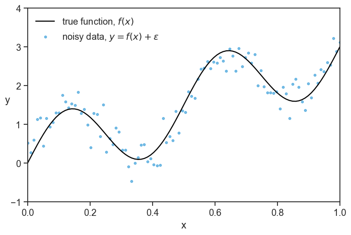
Note: don’t pay much attention to the scale of the axes, the concrete example is just for illustration purposes, and the numbers are not meant to be realistic. Assume that x=0 means few years of education, and x=1 means many years of education. Assume that the higher the value of y, the higher the income, in whatever units you like.
Let’s say that I learn that John Doe belongs to the same population as the data I observed, and I know that John Doe has x_0 years of education. Can I predict his income? My job is to find a function \hat{f}(x) that best describes the process that generates the data, f(x). I can then use this function and give a prediction for John’s income, \hat{f}(x_0). There are infinite functions to choose from, what should I do? Not knowing much about the true function, I decide in this tutorial to describe it using a polynomial function. The problem is not only that I need to find the best coefficients for the polynomial, but I also need to decide on the degree of the polynomial! It could be a straight line (degree 1), a parabola (degree 2), or something a lot more complex, such as a 15-degree polynomial. How do I decide on the degree of the polynomial?
Let’s play a little bit. At first, I’ll choose a 3rd degree polynomial (a cubic function). I’ll repeat the experiment 8 times, which in our example means that I’ll conduct 8 surveys, each with a different sample of people. For each experiment, I’ll fit a cubic function to each experiment using the least-squares method, and see how the fitted functions look like.
plot 8 fitted functions from repeated experiments
np.random.seed(0)
deg = 3          # degree of the fitted polynomial
sigma = 0.3      # standard deviation of the noise
M = 8          # number of repeated experiments
n_train = 20     # number of observed points used to fit in each experiment
fig, ax = plt.subplots(2, 4, figsize=(8, 4), sharex=True, sharey=True)
ax = ax.flatten()
for i in range(M):
    idx = np.random.choice(N, size=n_train, replace=False)
    noise = np.random.normal(0, sigma, size=n_train)
    x_m = x_grid[idx]
    y_m = f(x_m) + noise
    # fit with a numerically stable polynomial basis (chebyshev)
    p = Chebyshev.fit(x_m, y_m, deg, domain=[0, 1])
    l_true, = ax[i].plot(x_grid, f(x_grid), color='black', label='true function', alpha=0.2)
    l_data = ax[i].scatter(x_m, y_m, s=10, alpha=0.3, color=blue)
    l_fitted, = ax[i].plot(x_grid, p(x_grid), color=blue, label='fitted function')
    ax[i].text(0.97, 0.97, f"m={i+1}", transform=ax[i].transAxes,
            horizontalalignment='right', verticalalignment='top',)
    if i ==0:
        ax[i].legend([l_data, l_fitted, l_true],
          ["data", "fitted function", "true function"],
          loc="center left",
          bbox_to_anchor=(0.0,1.1),
          frameon=False, fancybox=False, shadow=False, ncol=3,)
    if i >= 4:
        ax[i].set(xlabel="x")
    if i % 4 == 0:
        ax[i].set_ylabel("y", rotation=0, labelpad=10)
    ax[i].set(xlim=(x_grid[0], x_grid[-1]),
              ylim=(-1, 4),
              xticks=[],
              yticks=[])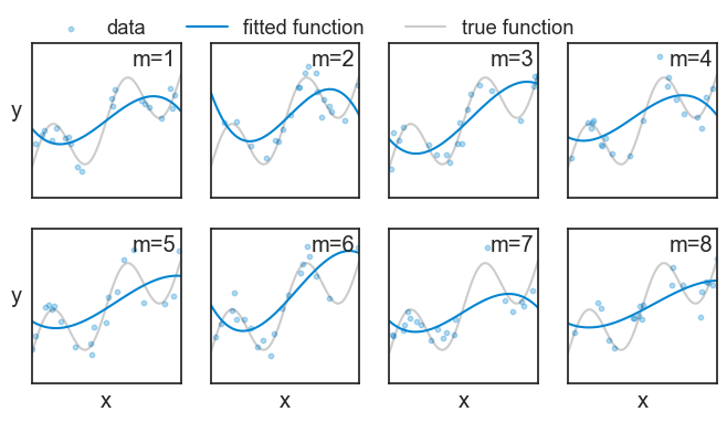
In the code above, we fitted a polynomial using numpy’s Chebyshev.fit function. For cubics (degree 3), it would be the same if we used the usual numpy.polyfit function, but for higher degrees, numpy.polyfit can be numerically unstable, and Chebyshev.fit is more robust.
Note that in each experiment m we observe a different set of data points, and therefore we get a different fitted function {\hat{f}}_m(x). We will do the same for 200 experiments, and plot it as a “spaghetti plot”:
generate data for 200 repeated experiments, and fit each of them
np.random.seed(0)
deg = 3          # degree of the fitted polynomial
sigma = 0.3      # standard deviation of the noise
M = 200          # number of repeated experiments
n_train = 20     # number of observed points used to fit in each experiment

# we'll store the predictions of all M fitted models on the full x_grid in this array
preds = np.empty((M, N))

for m in range(M):
    # choose which points are observed
    idx = np.random.choice(N, size=n_train, replace=False)
    # generate noisy observations at those points
    noise = np.random.normal(0, sigma, size=n_train)
    x_m = x_grid[idx]
    y_m = f(x_m) + noise
    # fit with a numerically stable polynomial basis (chebyshev)
    # we get a callable polynomial
    p = Chebyshev.fit(x_m, y_m, deg, domain=[0, 1])
    # evaluate the fitted model on the full grid (common x for averaging across fits)
    preds[m, :] = p(x_grid)
spaghetti plot of all 200 fitted functions
fig, ax = plt.subplots(figsize=(8, 5))
ax.plot(x_grid, f(x_grid), color="black", label=r"true function, $f(x)$")
ax.plot([], [], color=blue, label="fitted functions")
for m in range(M):
    ax.plot(x_grid, preds[m, :], color=blue, alpha=0.05)
ax.axvline(x=0.6, color=green, linestyle=":")
ax.legend(loc='upper left', frameon=False)
ax.set(xlim=(x_grid[0], x_grid[-1]),
       ylim=(-1, 4),
       xlabel="x",);
ax.set_ylabel("y", rotation=0);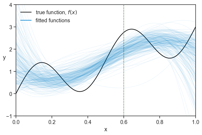
A pattern seems to emerge!
Now, let’s focus on a tiny slice of the graph, centered at x=0.6 (the vertical dotted line)
a thin slice
fig, ax = plt.subplots(figsize=(8, 5))
test_point = [0.6, f(0.6)+0.8]
ax.plot(*test_point, ls="None", marker="o", markersize=5, mec=pink, mfc=pink)
ax.plot(x_grid, f(x_grid), color="black", label=r"true function, $f(x)$")
ax.annotate(
    "",
    xy=(0.6, f(0.6)),
    xytext=tuple(test_point),
    arrowprops=dict(arrowstyle="<->", color=pink, lw=1.5, connectionstyle="bar,fraction=-0.5",
                    shrinkA=5, shrinkB=5),
)
ax.text(test_point[0]+0.010, test_point[1], r"$y=f(x)+\epsilon$", color=pink, fontsize=14, ha="left", va="center")
ax.plot([], [], color=blue, label=r"fitted functions, $\hat{f}_m(x)$")
ax.legend(loc='upper left', frameon=False)
for m in range(M):
    ax.plot(x_grid, preds[m, :], color=blue, alpha=0.05)
ax.axvline(x=0.6, color=green, linestyle=":")
ax.set(xlim=(0.54, 0.66),
       ylim=(-1, 4),
       xlabel="x",);
ax.set_ylabel("y", rotation=0);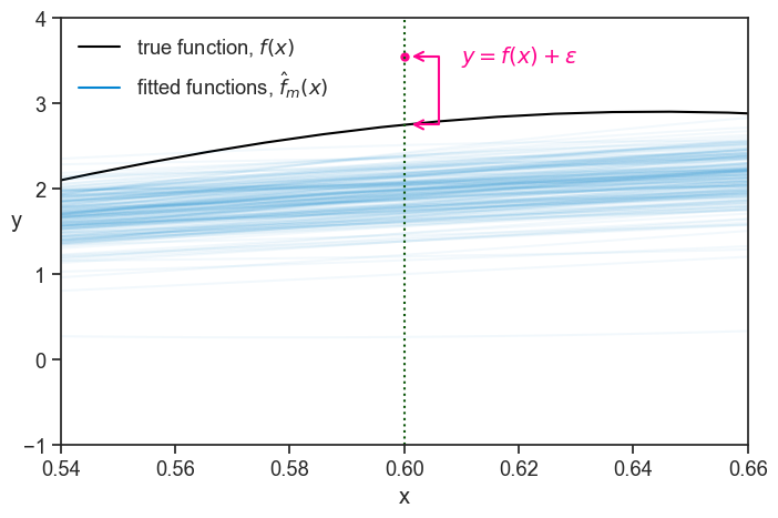
The pink dot denotes a “test point”. We can think of it as representing a future measurement at x=0.6 (another person interviewed that we know has x=0.6 years of education). Since we now have a bunch of fitted functions, we can ask how well do we expect them to predict the value of y at x=0.6? Or, turning it around, how badly do we expect them to err the value of y at x=0.6? The error for a specific fitted function at a specific x value is the vertical distance between it and the test point:
\text{error} = \hat{f}_m(x) - y.
The expected squared error over all repetitions of the experiment, that is, over all fitted functions, is:
\mathbb{E}_D[(\hat{f}(x) - y)^2\mid x],
where the symbols |x mean “given x”, meaning that we are looking at the error at a specific value of x.
Note that:
- This error exists because each curve was fitted (trained) on a different random dataset D, and because of the noise \epsilon in the test point.
- If we were to calculate the expected error without the square, positive and negative errors could cancel each other out, and we could get a low value even for a very bad model. By squaring the error, we make sure that all errors contribute positively to the expected error. More on that later.
52.1 expected squared error
What follows is a derivation of the expected squared error. If you don’t care about how we get to the formula, you can skip to the next section.
We start by substituting the value of y=f(x)+\epsilon in the expected error: \mathbb{E}_D[(\hat{f}(x) - f(x) - \epsilon)^2\mid x].
Let’s call A = \hat{f}(x) - f(x). Then the expected squared error becomes:
\mathbb{E}_D[(A - \epsilon)^2\mid x].
Expanding the square, we get:
\begin{align*} \mathbb{E}_D[(A - \epsilon)^2\mid x] &= \mathbb{E}_D[A^2 - 2A\epsilon + \epsilon^2\mid x] \\ &= \underbrace{\mathbb{E}_D[A^2\mid x]}_{\text{term 1}} - 2\underbrace{\mathbb{E}_D[A\epsilon\mid x]}_{\text{term 2}} + \underbrace{\mathbb{E}_D[\epsilon^2\mid x]}_{\text{term 3}}. \end{align*}
term 2: the test noise \epsilon is independent of the training dataset D, therefore independent of \hat{f}(x) and of A. Remember also that we assumed that the noise has zero mean, so \mathbb{E}[\epsilon] = 0. Therefore:
\mathbb{E}_D[A\epsilon\mid x] = \mathbb{E}_D[A\mid x]\cdot\mathbb{E}[\epsilon] = \mathbb{E}_D[A\mid x]\cdot 0 = 0.
term 3: we can use the identity that for a random variable \epsilon with finite variance, \mathbb{E}[\epsilon^2] = \text{Var}(\epsilon) + (\mathbb{E}[\epsilon])^2. Since we assumed that \epsilon has zero mean, the last term is zero, and we get: \mathbb{E}_D[\epsilon^2\mid x] = \text{Var}(\epsilon) = \sigma^2.
Let’s take stock of what we have so far. The expected error is now:
\begin{align*} \mathbb{E}_D[(\hat{f}(x) - y)^2\mid x] &= \mathbb{E}_D[A^2\mid x] + \sigma^2 \\ &= \mathbb{E}_D[(\hat{f}(x) - f(x))^2\mid x] + \sigma^2. \end{align*}
The first term is the error from the model \hat{f} not matching the ground truth f, and the second term is an irreducible error from the noise in the data. Let’s analyze the first term a bit more.
We define the mean predictor at x to be:
\mu(x) = \mathbb{E}_D[\hat{f}(x)\mid x].
In the graph above, it would simply be the mean of all the 200 blue lines at a specific x value. Now let’s perform a little trick: we add and subtract \mu(x) inside the parenthesis in the first term:
\hat{f}(x) - f(x) = \left(\hat{f}(x) - \mu(x)\right) + \Bigl(\mu(x) - f(x)\Bigr).
Now squaring it:
(\hat{f} - f)^2 = \left(\hat{f} - \mu\right)^2 + \Bigl(\mu - f\Bigr)^2 + 2\left(\hat{f} - \mu\right)\Bigl(\mu - f\Bigr).
What we wanted to analyze is the expected value of this expression:
\begin{align*} \mathbb{E}_D[(\hat{f} - f)^2\mid x] &= \mathbb{E}_D\left[\left(\hat{f} - \mu\right)^2\mid x\right] \\ &+ \Bigl(\mu - f\Bigr)^2 \\ &+ 2\Bigl(\mu - f\Bigr)\mathbb{E}_D\left[\left(\hat{f} - \mu\right)\mid x\right] \end{align*}
In the 2nd and 3rd terms, the term (\mu - f) got out of the expectation operator \mathbb{E} because it is a constant, not a random variable. This expression looks complicated, but it can get simpler. Let’s start with the last term. Since \mu is the expected value of \hat{f}, we have:
\mathbb{E}_D\left[\left(\hat{f} - \mu\right)\mid x\right] = \mathbb{E}_D\left[\hat{f}\mid x\right] - \mu = \mu - \mu = 0.
The very last thing we do now is to give names to the first two terms. The first term is called the variance of the model,
\text{Var}\left[\hat{f}(x)\right] = \mathbb{E}_D\left[\left(\hat{f}(x) - \mu(x)\right)^2\mid x\right],
and the second term is the square of the bias of the model,
\text{Bias}^2\left[\hat{f}(x)\right] = \Bigl(\mu(x) - f(x)\Bigr)^2.
52.2 bias–variance–noise decomposition
Putting everything together, we get the following decomposition of the expected squared error:
\mathbb{E}_D[(\hat{f}(x) - y)^2\mid x] = \text{Var}\left[\hat{f}(x)\right] + \text{Bias}^2\left[\hat{f}(x)\right] + \sigma^2.
We did all this hard work of deriving this decomposition to understand the different sources of error in our model. Hopefully, a good model will give a low expected error. Let’s see a few examples of repeated experiments, this time for polynomials of degree 3, 6, and 11.
calculate mean and std for all degrees from 1 to 15
np.random.seed(0)
degree_max = 15  # degree of the fitted polynomial
sigma = 0.3      # standard deviation of the noise
M = 200          # number of repeated experiments
n_train = 20     # number of observed points used to fit in each experiment

# we'll store the predictions of all M fitted models on the full x_grid in this array
preds15 = np.empty((M, N, degree_max))

for deg in range(1, degree_max+1):

    for m in range(M):
        # generate a new noisy realization of the data on the fixed grid
        noise = np.random.normal(0, sigma, size=N)
        y = f(x_grid) + noise

        # choose which n_train grid points are "observed" in this experiment
        idx = np.random.choice(N, size=n_train, replace=False)

        # # fit a degree-deg polynomial to the observed points
        # coeffs = np.polyfit(x_grid[idx], y[idx], deg)

        # # turn the fitted coefficients into a callable polynomial
        # p = np.poly1d(coeffs)
        # fit with a numerically stable polynomial basis (chebyshev)
        # we get a callable polynomial
        p = Chebyshev.fit(x_grid[idx], y[idx], deg, domain=[0, 1])

        # evaluate the fitted model on the full grid (common x for averaging across fits)
        preds15[m, :, deg-1] = p(x_grid)

# calculate the mean prediction and its standard deviation across the M fitted models, for every point on the x-grid
mean_pred = preds15.mean(axis=0)
std_pred  = preds15.std(axis=0)
plot 8 fitted functions from repeated experiments
np.random.seed(0)
degr = [3, 6, 11] # list of degrees to fit
sigma = 0.3      # standard deviation of the noise
M5 = 5          # number of repeated experiments
n_train = 20     # number of observed points used to fit in each experiment
fig, ax = plt.subplots(3, 6, figsize=(8, 4), sharex=True, sharey=True)
for d, deg in enumerate(degr):
    ax[d,0].set_ylabel(f"deg={deg}", labelpad=10)
    for m in range(M):
        ax[d, 5].plot(x_grid, preds15[m, :, deg-1], color=blue, alpha=0.02)
        if d ==0:
            ax[d, 5].set_title(f"200 fits")
    ax[d, 5].plot(x_grid, f(x_grid), color='black', label='true function', alpha=1)
    for i in range(M5):
        idx = np.random.choice(N, size=n_train, replace=False)
        noise = np.random.normal(0, sigma, size=n_train)
        x_m = x_grid[idx]
        y_m = f(x_m) + noise
        p = Chebyshev.fit(x_m, y_m, deg, domain=[0, 1])
        l_true, = ax[d, i].plot(x_grid, f(x_grid), color='black', label='true function', alpha=0.2)
        l_data = ax[d, i].scatter(x_m, y_m, s=10, alpha=0.3, color=blue)
        l_fitted, = ax[d, i].plot(x_grid, p(x_grid), color=blue, label='fitted function')
        if d ==0:
            ax[0,i].set_title(f"m={i+1}")
        ax[d, i].set(xlim=(x_grid[0], x_grid[-1]),
                ylim=(-1, 4),
                xticks=[],
                yticks=[])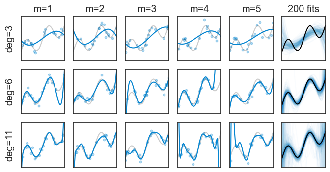
In the top row we fitted a 3rd degree polynomial. None of the five examples does a great job at approximating the true function, and this is quantified by their high bias. On the other hand, at least they are all pretty similar to each other. Remember: each repeated experiment drew a different set of data points, but all 3rd order polynomials are still pretty similar to each other. This is quantified by their low variance. The last plot on the right shows 200 fitted functions, and we can see that they are all pretty similar to each other (the spaghetti is not too messy), but the overall shape in the aggregate is far from the true black curve.
The bottom row shows the opposite. The 11th degree polynomials are very flexible, and they can approximate the true function very well, which is quantified by their low bias. However, this flexibility comes at a cost: the fitted functions are very different from each other, and this is quantified by their high variance. Here, the spaghetti plot on the right is very messy, and the aggregate of all fitted functions is very close to the true function.
High bias: We can understand that high bias means that a model is not flexible enough to capture the true function, and therefore it is systematically wrong in its predictions.
High variance: We can understand that high variance means that a model is highly sensitive to the specific data points it was trained on. If we were to train the same model on a different dataset, we would get a very different fitted function.Instead of showing spaghetti plots, we can compute the mean and standard deviation of all repeated experiments. It the plot below, the mean is the blue line, and the shaded area represents ±1 standard deviation.
plot results for all degrees from 1 to 15
fig, ax = plt.subplots(3, 5, figsize=(10, 6), sharex=True, sharey=True)
ax = ax.flatten()
for i in range(15):
    ax[i].plot(x_grid, f(x_grid), color="black", label="true function")
    ax[i].plot(x_grid, mean_pred[:, i], label=f"mean prediction (deg={i+1})", color=blue)
    ax[i].fill_between(x_grid, mean_pred[:, i] - std_pred[:, i], mean_pred[:, i] + std_pred[:, i], alpha=0.25, label="±1 std", color=blue)

    ax[i].text(0.97, 0.97, f"deg={i+1}", transform=ax[i].transAxes,
            horizontalalignment='right', verticalalignment='top',)
    if i >= 10:
        ax[i].set(xlabel="x")
    if i % 5 == 0:
        ax[i].set_ylabel("y", rotation=0, labelpad=10)
    ax[i].set(xlim=(x_grid[0], x_grid[-1]),
              ylim=(-1, 4),
              xticks=[],
              yticks=[])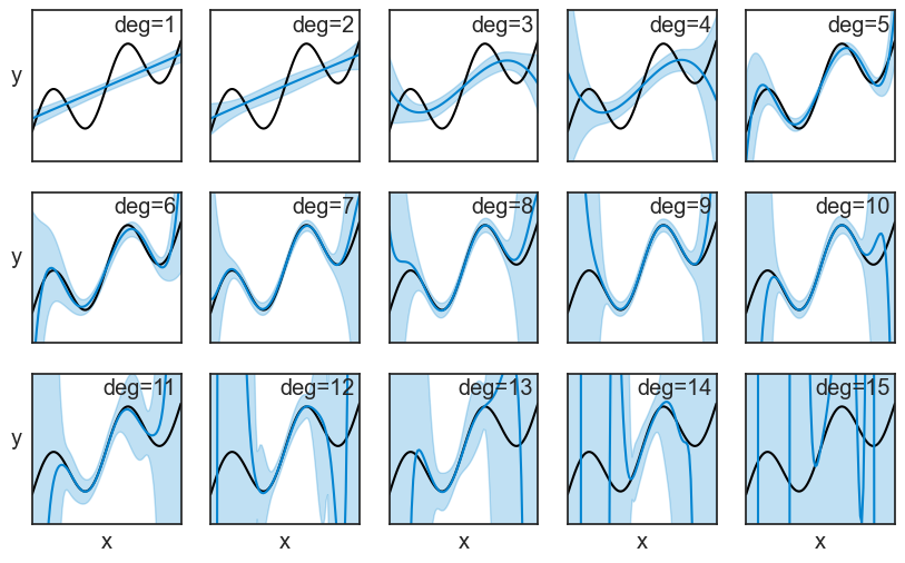
We can actually see the bias and variance in these plots. To make it more clear, let’s focus on two polynomials: the 3rd degree and the 8th degree. The bias squared and the variance, shown in the middle and right columns, are just the square of the distances marked on the left column.
bias-variance decomposition for deg=3 and deg=8
fig, ax = plt.subplots(2, 3, figsize=(10, 6))

deg_A = 3
ax[0,0].plot(x_grid, f(x_grid), color="black", label="true function")
ax[0,0].plot(x_grid, mean_pred[:, deg_A-1], label=f"mean prediction (deg={deg_A})", color=blue)
ax[0,0].fill_between(x_grid, mean_pred[:, deg_A-1] - std_pred[:, deg_A-1], mean_pred[:, deg_A-1] + std_pred[:, deg_A-1], alpha=0.25, label="±1 std", color=blue)
ax[0,0].set_box_aspect(1)
ax[0,0].set(xlim=(x_grid[0], x_grid[-1]),
        ylim=(-1, 4),
        xticks=[],
        yticks=[],
        xlabel="x",
        ylabel="deg=3")
idx = int(0.6 * len(x_grid))
ax[0,0].plot([x_grid[idx]]*2, [f(x_grid[idx]), mean_pred[idx, deg_A-1]], color=green, lw=2)
ax[0,0].plot([x_grid[idx]]*2, [mean_pred[idx, deg_A-1], mean_pred[idx, deg_A-1]-std_pred[idx, deg_A-1]], color=pink, lw=2)

ax[0,1].plot(x_grid, (f(x_grid)-mean_pred[:, deg_A-1])**2, color="black", label="true function")
ax[0,1].fill_between(x_grid, 0, (f(x_grid)-mean_pred[:, deg_A-1])**2, color=green, label="bias^2")
ax[0,2].plot(x_grid, (std_pred[:, deg_A-1])**2, color="black", label="true function")
ax[0,2].fill_between(x_grid, 0, (std_pred[:, deg_A-1])**2, color=pink, label="variance")
ax[0,1].set_box_aspect(1)
ax[0,2].set_box_aspect(1)
ax[0,1].set(xlim=(x_grid[0], x_grid[-1]),
        ylim=(0, 2),
        xticks=[],
        xlabel="x",
        yticks=[0,2])
ax[0,2].set(xlim=(x_grid[0], x_grid[-1]),
        ylim=(0, 2),
        xticks=[],
        xlabel="x",
        yticks=[0,2])

ax[0,1].text(0.5, 0.97, r"Bias$^2$", transform=ax[0,1].transAxes,
         horizontalalignment='center', verticalalignment='top',)
ax[0,2].text(0.5, 0.97, r"Variance", transform=ax[0,2].transAxes,
         horizontalalignment='center', verticalalignment='top',)


###

deg_B = 8
ax[1,0].plot(x_grid, f(x_grid), color="black", label="true function")
ax[1,0].plot(x_grid, mean_pred[:, deg_B-1], label=f"mean prediction (deg={deg_B})", color=blue)
ax[1,0].fill_between(x_grid, mean_pred[:, deg_B-1] - std_pred[:, deg_B-1], mean_pred[:, deg_B-1] + std_pred[:, deg_B-1], alpha=0.25, label="±1 std", color=blue)
ax[1,0].set_box_aspect(1)
ax[1,0].set(xlim=(x_grid[0], x_grid[-1]),
        ylim=(-1, 4),
        xticks=[],
        yticks=[],
        xlabel="x",
        ylabel="deg=8")
idx = int(0.13 * len(x_grid))
ax[1,0].plot([x_grid[idx]]*2, [f(x_grid[idx]), mean_pred[idx, deg_B-1]], color=green, lw=2)
ax[1,0].plot([x_grid[idx]]*2, [mean_pred[idx, deg_B-1], mean_pred[idx, deg_B-1]+std_pred[idx, deg_B-1]], color=pink, lw=2)

ax[1,1].plot(x_grid, (f(x_grid)-mean_pred[:, deg_B-1])**2, color="black", label="true function")
ax[1,1].fill_between(x_grid, 0, (f(x_grid)-mean_pred[:, deg_B-1])**2, color=green, label="bias^2")
ax[1,2].plot(x_grid, (std_pred[:, deg_B-1])**2, color="black", label="true function")
ax[1,2].fill_between(x_grid, 0, (std_pred[:, deg_B-1])**2, color=pink, label="variance")
ax[1,1].set_box_aspect(1)
ax[1,2].set_box_aspect(1)
ax[1,1].set(xlim=(x_grid[0], x_grid[-1]),
        ylim=(0, 2),
        xticks=[],
        xlabel="x",
        yticks=[0,2])
ax[1,2].set(xlim=(x_grid[0], x_grid[-1]),
        ylim=(0, 2),
        xticks=[],
        xlabel="x",
        yticks=[0,2])

ax[1,1].text(0.5, 0.97, r"Bias$^2$", transform=ax[1,1].transAxes,
         horizontalalignment='center', verticalalignment='top',)
ax[1,2].text(0.5, 0.97, r"Variance", transform=ax[1,2].transAxes,
         horizontalalignment='center', verticalalignment='top',);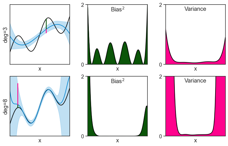
52.3 tradeoff
We quantified the bias and the variance at every specific value of x. It makes sense to ask: if we aggregate the bias and the variance across all x values, can we get a single number that quantifies the overall bias and variance of the model? In mathematical terms, we can take the expected value of the squared error across all x values:
\begin{align*} \mathbb{E}_x\left[\mathbb{E}_D[(\hat{f}(x) - y)^2\mid x]\right] &= \mathbb{E}_x\left[\text{Var}\left[\hat{f}(x)\right]\right] \\ &+ \mathbb{E}_x\left[\text{Bias}^2\left[\hat{f}(x)\right]\right]\\ &+ \sigma^2 \end{align*}
Once more the noise term gets out of the expectation operator because it is a constant, not a random variable. The actual calculation that we execute with \mathbb{E}_x requires us to specify a distribution over x values. See three possible choices:
- We can assume that x is uniformly distributed in the interval [0, 1]. This means that we are equally interested in all x values between 0 and 1, and we want to give them equal weight when calculating the overall bias and variance. In our concrete example, this would mean that all levels of education between 0 and 1 are equally important to us, and we want to give them equal weight when calculating the overall bias and variance of our model. This is a common choice in theoretical analyses, but it may not always be the most realistic one.
- We can assume that x is distributed according to the distribution of the data points that we actually observed in the dataset. The “empirical distribution” of the data points gives more weight to x values that are more common in the observed data, and less weight to x values that are less common. For instance, our dataset may have more people with an education level lower than 0.2 than people with an education level higher than 0.8, so it wouldn’t make sense to give them equal weight when calculating the overall bias and variance.
- We might know the true distribution of x in the population, and use it to calculate the overall bias and variance. In our example, we might have access to census data that tells us the distribution of education levels in the population, and we can use this information to calculate the overall bias and variance of our model.
For simplicity’s sake, let’s assume that x is uniformly distributed in the interval [0, 1]. See how the overall bias and variance change as we increase the degree of the polynomial.
Show the code
fig, ax = plt.subplots(figsize=(8, 4))
ax.plot(p_order, bias2, label="Bias²", marker='o', color=green)
ax.plot(p_order, var, label="Variance", marker='o', color=pink)
ax.set(xlabel="Polynomial Degree",
       ylabel="Error",
       xticks=p_order,
       title="Bias-Variance Tradeoff",
       ylim=(0, 2));
ax.legend(loc='upper left', frameon=False);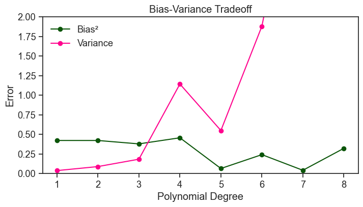
In broad terms, and for fixed data size and noise level, increasing the degree of the polynomial tends to decrease the bias and increase the variance. This is what we call the bias-variance tradeoff. A model with low bias and low variance would be ideal, but with finite data these two goals are typically in tension. Increasing model complexity can reduce bias, but often at the cost of increased variance; decreasing complexity has the opposite effect.
The curves above are quite jagged, and we do not observe a smooth monotonic decrease in bias or increase in variance. This is partly because we are estimating bias and variance from a finite number of repeated experiments. To reduce this Monte Carlo noise and make the underlying trends clearer, we repeat the analysis below using 5000 experiments instead of 200, and sampling 50 data points per experiment instead of 20.
compute overall bias and variance for all degrees from 1 to 15
# setup
np.random.seed(0)
N = 100
x_grid = np.linspace(0, 1, N)
f = lambda x: np.sin(4*np.pi*x) + 3*x

sigma = 0.3
M = 5000
n_train = 50
degrees = np.arange(1, 13)

# pre-generate randomness once (shared across all degrees)
noise_mat = np.random.normal(0, sigma, size=(M, N))
idx_mat = np.array([np.random.choice(N, size=n_train, replace=False) for _ in range(M)])

bias2_list = []
var_list = []

for deg in degrees:
    preds = np.empty((M, N))

    for m in range(M):
        # generate dataset m (same x_grid, new noise)
        y = f(x_grid) + noise_mat[m]

        # observe subset for training
        idx = idx_mat[m]

        # fit with a numerically stable polynomial basis (chebyshev)
        p = Chebyshev.fit(x_grid[idx], y[idx], deg, domain=[0, 1])

        # evaluate on the common grid
        preds[m] = p(x_grid)

    mean_pred = preds.mean(axis=0)
    std_pred = preds.std(axis=0)

    # bias^2 and variance aggregated over x
    bias2_list.append(np.mean((mean_pred - f(x_grid))**2))
    var_list.append(np.mean(std_pred**2))

bias2_arr = np.array(bias2_list)
var_arr = np.array(var_list)
plot tradeoff
fig, ax = plt.subplots()
ax.plot(degrees, bias2_arr + var_arr, lw=5, alpha=0.3, label="bias² + variance", color='black')
ax.plot(degrees, bias2_arr, marker="o", label="bias²", color=green)
ax.plot(degrees, var_arr, marker="o", label="variance", color=pink)
ax.set(xlabel="polynomial degree", ylabel="error", title="bias-variance tradeoff")
ax.set_yscale("log")
ax.legend(frameon=False);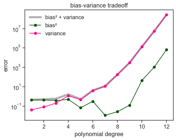
I did not include the intrinsic noise \sigma^2 in the plot above, because it is a constant that does not depend on the degree of the polynomial. The bias and variance are the only terms that change as we increase the degree of the polynomial.
If our aim is to minimize the expected error, we should choose a polynomial degree that minimizes the sum of bias and variance. In the plot above, the sweet spot of the bias-variance tradeoff for this specific problem is around a degree of 7.
The figure above is pretty typical for bias-variance tradeoff plots. As the polynomial order increases, bias goes down and variance goes up. You might have noticed, by I cheated to get this nice typical plot. The justification behind increasing the number of experiments was solid, but why did I have to increase the number of data points per experiment from 20 to 50? I should have been consistent. I believe that a good tutorial not only shows the wins, it also shows the losses. See below what I should have done: 5000 experiments with 20 data points per experiment.
compute overall bias and variance for all degrees from 1 to 15
# setup
np.random.seed(0)
N = 100
x_grid = np.linspace(0, 1, N)
f = lambda x: np.sin(4*np.pi*x) + 3*x

sigma = 0.3
M = 5000
n_train = 20
degrees = np.arange(1, 13)

# pre-generate randomness once (shared across all degrees)
noise_mat = np.random.normal(0, sigma, size=(M, N))
idx_mat = np.array([np.random.choice(N, size=n_train, replace=False) for _ in range(M)])

bias2_list = []
var_list = []

for deg in degrees:
    preds = np.empty((M, N))

    for m in range(M):
        # generate dataset m (same x_grid, new noise)
        y = f(x_grid) + noise_mat[m]

        # observe subset for training
        idx = idx_mat[m]

        # fit with a numerically stable polynomial basis (chebyshev)
        p = Chebyshev.fit(x_grid[idx], y[idx], deg, domain=[0, 1])

        # evaluate on the common grid
        preds[m] = p(x_grid)

    mean_pred = preds.mean(axis=0)
    std_pred = preds.std(axis=0)

    # bias^2 and variance aggregated over x
    bias2_list.append(np.mean((mean_pred - f(x_grid))**2))
    var_list.append(np.mean(std_pred**2))

bias2_arr = np.array(bias2_list)
var_arr = np.array(var_list)
plot tradeoff
fig, ax = plt.subplots()
ax.plot(degrees, bias2_arr + var_arr, lw=5, alpha=0.3, label="bias² + variance", color='black')
ax.plot(degrees, bias2_arr, marker="o", label="bias²", color=green)
ax.plot(degrees, var_arr, marker="o", label="variance", color=pink)
ax.set(xlabel="polynomial degree", ylabel="error", title="bias-variance tradeoff")
ax.set_yscale("log")
ax.legend(frameon=False);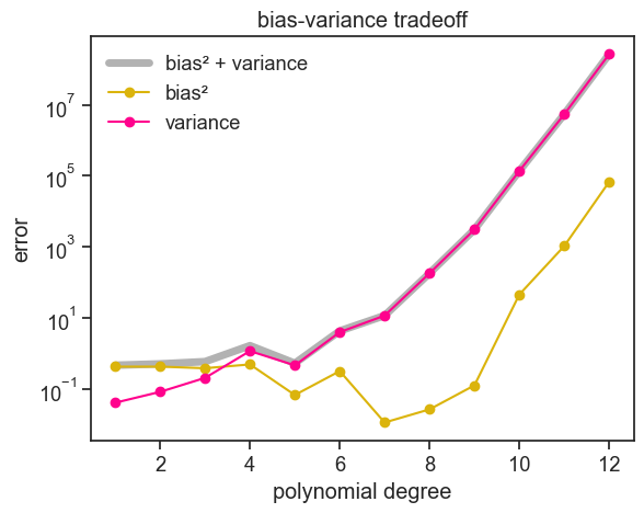
Two things are obvious:
- the bias increases a lot for higher degree polynomials. It should only go down, right?
- the variance goes up, as expected, but pay attention to the scale of the y-axis. The variance is much higher than in the previous plot.
I am not sure what’s going on here. Let me raise some possible explanations:
- each experiment samples only 20 data points, but the highest degree polynomial is 12. We might be getting close to the interpolation regime, where the fitted function goes through all the data points, and therefore it is very sensitive to the specific data points that were sampled. This could explain the high variance, but it does not explain the high bias.
- we estimate bias by computing a Monte-Carlo mean \hat{\mu}. If variance is so large at higher degree polynomials, our estimate of bias might be very noisy,and it might take a lot more that 5000 experiments to get a stable estimate of bias.
I don’t know if this is true, more test are required. Maybe another time…
52.4 nerding out
The bias–variance–noise decomposition we derived is
\mathbb{E}_D[(\hat{f}(x) - y)^2\mid x] = \text{Var}\left[\hat{f}(x)\right] + \text{Bias}^2\left[\hat{f}(x)\right] + \sigma^2.
This equation is so similar to the Pythagorean theorem, that we might wonder if there’s anything in common between them. The answer is yes! In a way, the bias–variance–noise decomposition is a stochastic analogue of the sum-of-squares decomposition in linear regression, with orthogonality defined by expectation rather than by Euclidean inner products over data points. Let’s see how this works.
Let’s call \omega a specific experimental realization (e.g. 20 pairs of x,y data points as well as a test point). \omega is randomly drawn from the distribution of all possible experimental realizations, which we denote by \Omega. For a fixed input x, we can associate to each of these experimental realizations \omega a random variable, for example:
- \epsilon(\omega). Each experimental realization \omega has its own noise value \epsilon, and therefore we can think of \epsilon as a random variable.
- \hat{f}(x)(\omega). Each experimental realization \omega has its own fitted function \hat{f}(x), and therefore we can think of \hat{f}(x) as a random variable. Note: \hat{f}(x) is calculated for a fixed value of x, so it is a real number.
- \left(\hat{f}(x) - f(x)\right)(\omega). Each experimental realization \omega has its own value of \hat{f}(x) - f(x), and therefore we can think of \hat{f}(x) - f(x) as a random variable. Again, this is calculated for a fixed value of x, so it is a real number.
- You get the idea.
It’s useful to see a figure from before to grasp these ideas. Below, you see 200 \omega experimental realizations \omega_1,\ldots,\omega_{200}, each with its own fitted function \hat{f}(x) in blue, plus a test point in pink. At the specific value of x marked by the vertical dotted line, we can define several random variables (for example, \hat{f}(x), y, and \hat{f}(x)-y). If we record their values across the 200 independent realizations, we obtain a list of 200 numbers for each quantity. It is convenient to view this list of real numbers as a vector in a 200-dimensional space.
a thin slice
np.random.seed(0)
deg = 3          # degree of the fitted polynomial
sigma = 0.3      # standard deviation of the noise
M = 200          # number of repeated experiments
n_train = 20     # number of observed points used to fit in each experiment

# we'll store the predictions of all M fitted models on the full x_grid in this array
preds = np.empty((M, N))

for m in range(M):
    # choose which points are observed
    idx = np.random.choice(N, size=n_train, replace=False)
    # generate noisy observations at those points
    noise = np.random.normal(0, sigma, size=n_train)
    x_m = x_grid[idx]
    y_m = f(x_m) + noise
    # fit with a numerically stable polynomial basis (chebyshev)
    # we get a callable polynomial
    p = Chebyshev.fit(x_m, y_m, deg, domain=[0, 1])
    # evaluate the fitted model on the full grid (common x for averaging across fits)
    preds[m, :] = p(x_grid)

fig, ax = plt.subplots(figsize=(8, 5))
test_point = [0.6, f(0.6)+0.8]
ax.plot(*test_point, ls="None", marker="o", markersize=5, mec=pink, mfc=pink)
ax.plot(x_grid, f(x_grid), color="black", label=r"true function, $f(x)$")
ax.annotate(
    "",
    xy=(0.6, f(0.6)),
    xytext=tuple(test_point),
    arrowprops=dict(arrowstyle="<->", color=pink, lw=1.5, connectionstyle="bar,fraction=-0.5",
                    shrinkA=5, shrinkB=5),
)
ax.text(test_point[0]+0.010, test_point[1], r"$y=f(x)+\epsilon$", color=pink, fontsize=14, ha="left", va="center")
ax.plot([], [], color=blue, label=r"fitted functions, $\hat{f}_m(x)$")
ax.legend(loc='upper left', frameon=False)
for m in range(M):
    ax.plot(x_grid, preds[m, :], color=blue, alpha=0.05)
ax.axvline(x=0.6, color=green, linestyle=":")
ax.set(xlim=(0.54, 0.66),
       ylim=(-1, 4),
       xlabel="x",);
ax.set_ylabel("y", rotation=0);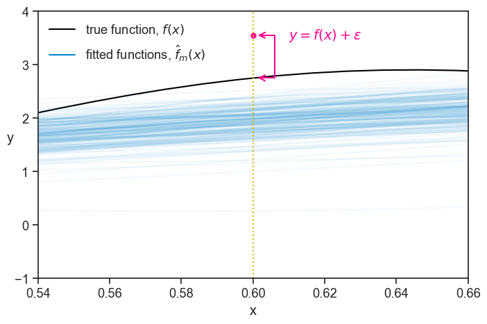
When we talked about the bias–variance tradeoff, we ran a simulation where we increased the number of experiments to 5000. In that case, each random variable was represented by a list of 5000 real numbers, one for each experimental realization \omega. It is convenient to view this list as a vector in a 5000-dimensional space, which provides a more stable empirical estimate of expectations and variances.
The idea now is to imagine taking more and more experimental realizations \omega from \Omega. In the idealized limit of infinitely many realizations, these empirical vectors converge to well-defined objects that can be viewed as vectors in an infinite-dimensional space. This limiting space is the Hilbert space of square-integrable random variables.
What is a Hilbert space?
A Hilbert space is a complete inner product space. Let’s unpack this definition, from the last word to the first:
- space: a set of objects (in our case, random variables) that we can add together and multiply by scalars, and that satisfy the usual vector space properties (e.g. associativity, commutativity, distributivity, etc.).
- inner product: a function that takes two objects from the space and returns a real number, that satisfies certain properties (e.g. positivity, linearity, symmetry, etc.). In our case, the inner product is defined as the expected value of the product of two (square-integrable) random variables: \langle A, B \rangle = \mathbb{E}[A \cdot B]. From the inner product, we also get the notion of a norm, which is defined as the square root of the inner product of a random variable with itself: \|A\| = \sqrt{\langle A, A \rangle} = \sqrt{\mathbb{E}[A^2]}. The norm gives us a way to measure the “length” of a random variable, and the inner product gives us a way to measure the “angle” between two random variables. In particular, if the inner product of two random variables is zero, we say that they are orthogonal. Finally, the qualifier “square-integrable” means that a random variable A has finite norm, that is, \|A\| < \infty (equivalently, \mathbb{E}[A^2] < \infty).
- complete: informally, a space is complete if it contains all the limits of sequences formed from its own elements. In our setting, this means that if a sequence of random variables becomes closer and closer in average squared distance, then their limiting random variable also belongs to the space. Completeness ensures that no “gaps” exist: limits of meaningful constructions do not fall outside the space.
See how the whole derivation of the bias-variance-noise decomposition can be understood as operations on vectors in a Hilbert space, where the inner product is defined by expectation. The point-wise error at x was defined as:
\text{error} = \hat{f} - y = \hat{f} - f - \epsilon.
We will do the same trick of adding and subtracting \mu(x), but first let’s interpret what it means:
\mu(x) = \mathbb{E}[\hat{f}(x)] = \mathbb{E}[\hat{f}(x)\cdot 1] = \langle \hat{f}(x), 1 \rangle.
The mean predictor can be understood as the projection of the random variable \hat{f}(x) onto the constant random variable 1. Attention: \mu is a constant scalar, not a random variable, and we will treat it as such in what follows.
Now we can rewrite the error as:
\begin{align*} \text{error} &= \underbrace{\left(\hat{f} - \mu\right)}_{\text{variance vector}} + \underbrace{\left(\mu - f\right)}_{\text{bias vector}} + \underbrace{\epsilon}_{\text{irreducible noise vector}}\\ &\text{or simply...}\\ \text{error} &= \vec{V} +\vec{B} +\vec{\epsilon} \end{align*}
We wish the best possible model, and that is one that minimizes the length of the error vector. The squared length of the error vector is given by its squared norm:
\begin{align*} \|\text{error}\|^2 &= \mathbb{E}\left[\left(\vec{V} +\vec{B} +\vec{\epsilon}\right)^2\right] \\ &= \mathbb{E}\left[\left(\vec{V} +\vec{B} +\vec{\epsilon}\right)\cdot\left(\vec{V} +\vec{B} +\vec{\epsilon}\right)\right] \\ &= \mathbb{E}\left[\vec{V}^2 +\vec{B}^2 +\vec{\epsilon}^2 + 2\vec{V}\cdot\vec{B} + 2\vec{V}\cdot\vec{\epsilon} + 2\vec{B}\cdot\vec{\epsilon}\right] \\ &= \mathbb{E}\left[\vec{V}^2 + \vec{B}^2 + \vec{\epsilon}^2\right] + 2\mathbb{E}\left[\vec{V}\cdot\vec{B} + \vec{V}\cdot\vec{\epsilon} + \vec{B}\cdot\vec{\epsilon}\right] \end{align*} The last line has two terms. The first term is the sum of the squared lengths of the variance, bias, and noise vectors. This is our end result. All we need to show now is that all the mixed terms are zero, that is, that the vectors for bias, variance, and noise are mutually orthogonal.
- \vec{V}\cdot\vec{B} = 0: The inner product of these two vectors is: \langle \vec{V}, \vec{B} \rangle = \mathbb{E}\left[(\hat{f} - \mu)(\mu - f)\right]. Since both \mu and f are constants, we can take them out of the expectation operator, and we get: \langle \vec{V}, \vec{B} \rangle = \mathbb{E}\left[\hat{f}(\mu - f)\right] - \mu(\mu - f) = \mu(\mu - f) - \mu(\mu - f) = 0.
- \vec{V}\cdot\vec{\epsilon} = 0: The inner product of these two vectors is: \langle \vec{V}, \vec{\epsilon} \rangle = \mathbb{E}\left[(\hat{f} - \mu)\epsilon\right]. Since \epsilon is independent of \hat{f} and has zero mean, we have: \langle \vec{V}, \vec{\epsilon} \rangle = \mathbb{E}\left[\hat{f}\epsilon\right] - \mu\mathbb{E}\left[\epsilon\right] = 0 - \mu\cdot 0 = 0.
- \vec{B}\cdot\vec{\epsilon} = 0: The inner product of these two vectors is: \langle \vec{B}, \vec{\epsilon} \rangle = \mathbb{E}\left[(\mu - f)\epsilon\right]. Since \epsilon is independent of \mu and f, and has zero mean, we have: \langle \vec{B}, \vec{\epsilon} \rangle = (\mu - f)\mathbb{E}\left[\epsilon\right] = (\mu - f)\cdot 0 = 0.
This is it, now we have
\|\text{error}\|^2 = \mathbb{E}\left[\vec{V}^2 + \vec{B}^2 + \vec{\epsilon}^2\right] = \text{Var}\left[\hat{f}(x)\right] + \text{Bias}^2\left[\hat{f}(x)\right] + \sigma^2.
The image that I have in my head, and that shows that the result above is a manifestation of the Pythagorean theorem, is this:
error vector in 3d
# create figure and 3d axis
fig = plt.figure(figsize=(6, 4), tight_layout=True)
ax = fig.add_subplot(111, projection='3d')
red = "xkcd:vermillion"
x0 = 1.5; y0 = 1; z0 = 0.8
# define vectors
x1 = np.array([x0, 0, 0])
x2 = np.array([0, y0, 0])
x3 = np.array([0, 0, z0])

# plot coordinate axes
ax.quiver(0, 0, 0, *x1, color='black', linewidth=2, arrow_length_ratio=0.1/x0)
ax.quiver(0, 0, 0, *x2, color='black', linewidth=2, arrow_length_ratio=0.1)
ax.quiver(0, 0, 0, *x3, color='black', linewidth=2, arrow_length_ratio=0.1/z0)

# label axes
ax.text(x0 + 0.05, 0, 0, r'$\vec{V}$', fontsize=12)
ax.text(0, y0 + 0.05, 0, r'$\vec{B}$', fontsize=12)
ax.text(0, 0, z0 + 0.05, r'$\vec{\epsilon}$', fontsize=12)

# define cube corners

corners = np.array([
    [0, 0, 0],
    [x0, 0, 0],
    [x0, y0, 0],
    [0, y0, 0],
    [0, 0, z0],
    [x0, 0, z0],
    [x0, y0, z0],
    [0, y0, z0],
])

# cube edges
edges = [
    (0, 1), (1, 2), (2, 3), (3, 0),
    (4, 5), (5, 6), (6, 7), (7, 4),
    (0, 4), (1, 5), (2, 6), (3, 7),
]

# draw cube
for i, j in edges:
    ax.plot(*zip(corners[i], corners[j]), color='black', linewidth=1)

# diagonal vector
diag = x1 + x2 + x3
diag_length = np.linalg.norm(diag)
ax.quiver(0, 0, 0, *diag, color=red, linewidth=3, arrow_length_ratio=0.1/diag_length)

# label diagonal
ax.text(*(diag + 0.05), r'error$=\vec{V} + \vec{B} + \vec{\epsilon}$', color=red, fontsize=12, ha="right")

# limits and aspect
ax.set_xlim(0, 1.2)
ax.set_ylim(0, 1.2)
ax.set_zlim(0, 1.2)
ax.set_box_aspect([1, 1, 1])

# hide axes completely
ax.set_axis_off()

# lower viewing angle
ax.view_init(elev=10, azim=-80)

plt.tight_layout()
plt.show()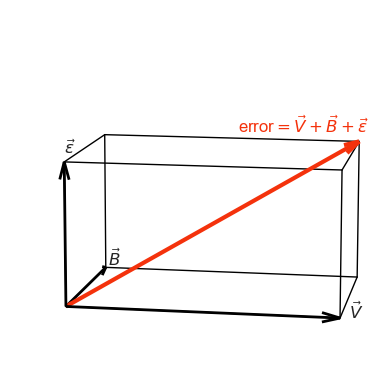
As usual in Math, we first had to think of our entities in a more abstract (and maybe less intuitive) way, so we could get a short a beautiful derivation of the bias-variance-noise decomposition.
52.5 concluding remarks
In practice, we observe only a single dataset when we perform a real-life experiment. Bias-variance analysis does not describe what happened in that particular dataset, but what would typically happen if the experiment were repeated under the same conditions. It provides a framework for reasoning about generalization, model complexity, and uncertainty, even when repeated experiments are not available.