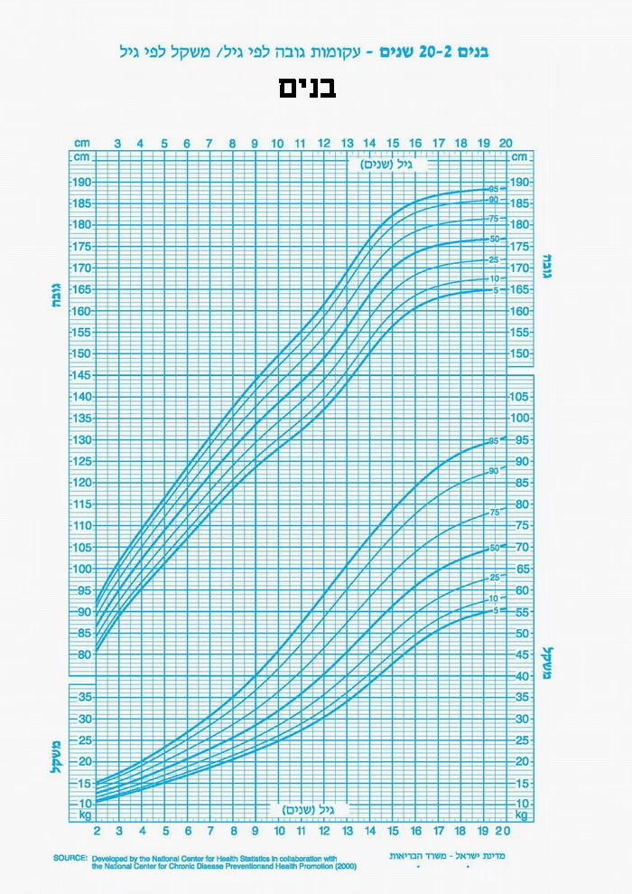
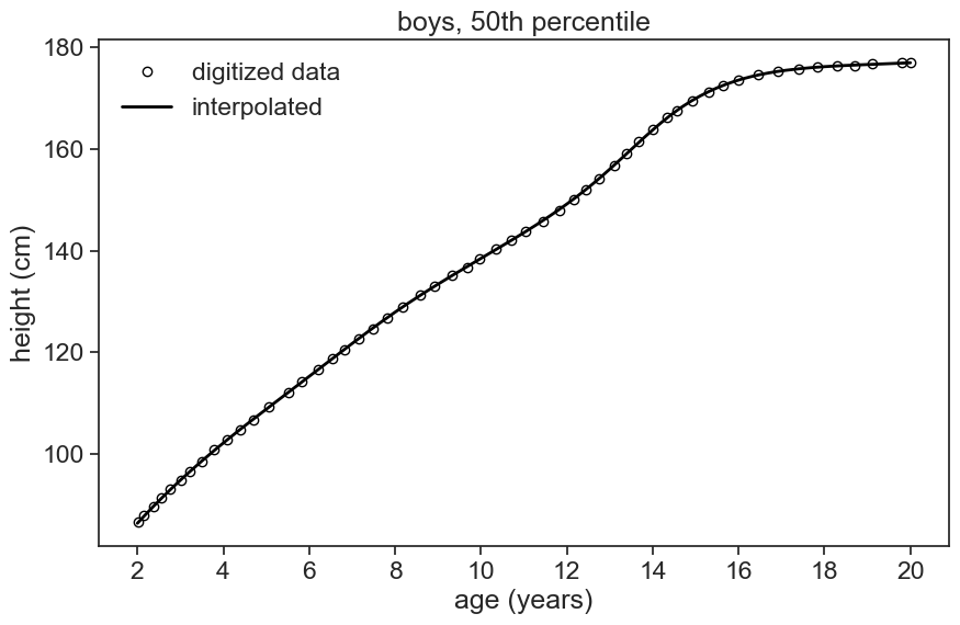
I used the great online resource Web Plot Digitizer v4 to extract the data from the images files. I captured all the growth curves as best as I could. The first step now is to get interpolated versions of the digitized data. For instance, see below the 50th percentile for boys:
import libraries
import pandas as pdimport numpy as npimport matplotlib.pyplot as pltimport seaborn as snssns.set_theme(style="ticks", font_scale=1.5)from scipy.optimize import curve_fitfrom scipy.special import erffrom scipy.interpolate import UnivariateSplineimport matplotlib.animation as animationfrom scipy.stats import normimport plotly.graph_objects as goimport plotly.io as piopio.renderers.default ='notebook'# %matplotlib widget
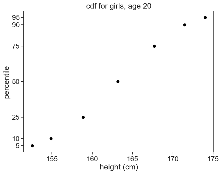
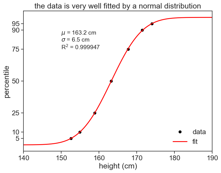
I suspect that the heights in the population are normally distributed. Let’s check that. I’ll fit the data to the integral of a gaussian, because the percentiles correspond to a cdf. If a pdf is a gaussian, its cumulative is given by
where \mu is the mean and \sigma is the standard deviation of the distribution. The error function \text{erf} is a sigmoid function, which is a good approximation for the cdf of the normal distribution.
data = df_girls.loc[20.0]params, _ = curve_fit(erf_model, data, percentile_list, p0=p0, bounds=([100, 3], # lower bounds for mu and sigma [200, 10]) # upper bounds for mu and sigma )# store the parameters in the dataframepercentile_predicted = erf_model(data, *params)# R-squared valuer2 = calculate_r2(percentile_list, percentile_predicted)
show results
fig, ax = plt.subplots(figsize=(8, 6))percentile_list = np.array([5, 10, 25, 50, 75, 90, 95])data = df_girls.loc[20.0]ax.plot(data, percentile_list, ls='', marker='o', markersize=6, color="black", label='data')fit = erf_model(height_list, *params)ax.plot(height_list, fit, label='fit', color="red", linewidth=2)ax.text(150, 75, f'$\mu$ = {params[0]:.1f} cm\n$\sigma$ = {params[1]:.1f} cm\nR$^2$ = {r2:.6f}', fontsize=14, bbox=dict(facecolor='white', alpha=0.5))ax.legend(frameon=False)ax.set(xlabel='height (cm)', xlim=(140, 190), ylabel='percentile', yticks=percentile_list, title="the data is very well fitted by a normal distribution" );
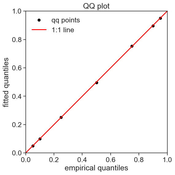
Another way of making sure that the model fits the data is to make a QQ plot. In this plot, the quantiles of the data are plotted against the quantiles of the normal distribution. If the data is normally distributed, the points should fall on a straight line.
p0 = [80, 3]# loop over ages in the index, calculate mu and sigmafor i in df_boys.index:# fit the model to the data data = df_boys.loc[i] params, _ = curve_fit(erf_model, data, percentile_list, p0=p0, bounds=([70, 2], # lower bounds for mu and sigma [200, 10]) # upper bounds for mu and sigma )# store the parameters in the dataframe df_stats_boys.at[i, 'mu'] = params[0] df_stats_boys.at[i, 'sigma'] = params[1] percentile_predicted = erf_model(data, *params)# R-squared value r2 = calculate_r2(percentile_list, percentile_predicted) df_stats_boys.at[i, 'r2'] = r2 p0 = params# same for girlsp0 = [80, 3]for i in df_girls.index:# fit the model to the data data = df_girls.loc[i] params, _ = curve_fit(erf_model, data, percentile_list, p0=p0, bounds=([70, 3], # lower bounds for mu and sigma [200, 10]) # upper bounds for mu and sigma )# store the parameters in the dataframe df_stats_girls.at[i, 'mu'] = params[0] df_stats_girls.at[i, 'sigma'] = params[1] percentile_predicted = erf_model(data, *params)# R-squared value r2 = calculate_r2(percentile_list, percentile_predicted) df_stats_girls.at[i, 'r2'] = r2 p0 = params# save the dataframes to csv filesdf_stats_boys.to_csv('../archive/data/height/boys_height_stats.csv', index=True)df_stats_girls.to_csv('../archive/data/height/girls_height_stats.csv', index=True)
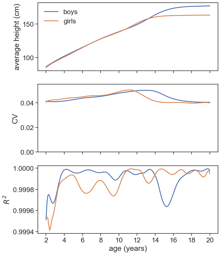
Let’s see what we got. The top panel in the graph shows the average height for boys and girls, the middle panel shows the coefficient of variation (\sigma/\mu), and the bottom panel shows the R2 of the fit (note that the range is very close to 1).