Go back to the weather station website, download one year of data from 01.01.2020 to 31.12.2020 (24h data). If you can’t download the data, just click here.
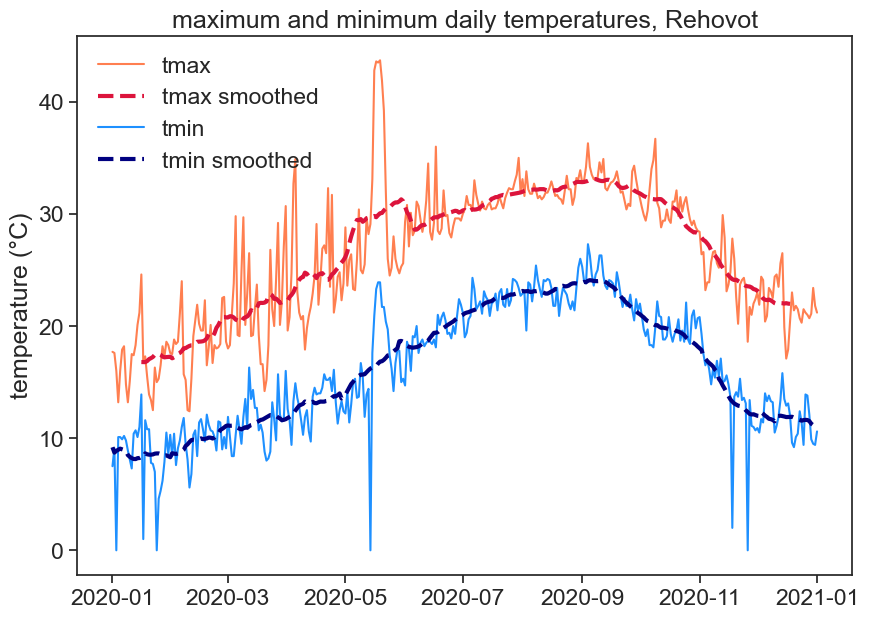
18.1 graph 1
Make one graph with the following:
daily tmax and tmin
smoothed data for tmax and tmin
In order to smooth the data with a 30 day window, use the following function: df['tmin'].rolling(30, center=True).mean()
This means that you will take the mean of 30 days, and put the result in the center of this 30-day window.
Play with this function, see what you can do with it. What happens when you change the size of the window? Why is the smoothed data shorter than the original data? See the documentation for rolling to find more options.
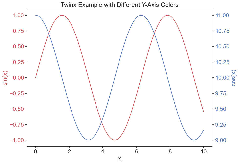
Make another graph that focuses on a part of the year, not the whole thing. We saw before how to do that. Put on this graph two lines, representing two variables of your choosing. Give these lines good colors, and maybe different linestyles (solid, dashed, dotted) if you feel fancy. If the two variable you choose have different units, or if they have very different values (e.g. one is between 0 and 1, the other between 100 and 200), then you might find useful the following code. Here we learn how to make another yaxis.
Show the code
# generate some sample datax = np.linspace(0, 10, 100)y1 = np.sin(x)y2 = np.cos(x) +10fig, ax1 = plt.subplots(figsize=(10,7))# create the first plotax1.plot(x, y1, 'r-', label='sin(x)')ax1.set_xlabel('x')ax1.set_ylabel('sin(x)', color='r')ax1.tick_params(axis='y', labelcolor='r')# instantiate a second y-axis that shares the same x-axisax2 = ax1.twinx()# create the second plotax2.plot(x, y2, 'b-', label='cos(x)')ax2.set_ylabel('cos(x)', color='b')ax2.tick_params(axis='y', labelcolor='b')# show the plotplt.title('Twinx Example with Different Y-Axis Colors')fig.tight_layout() # to ensure the labels don't overlap
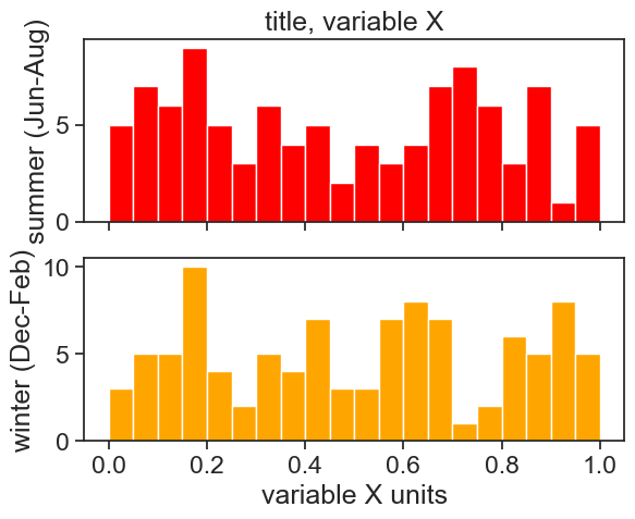
18.3 graph 3
Choose another variable, and make two histograms (each in its own panel), each representing a different time interval. Here is an example how you make subplots: