let's have fun plotting some data 😀
creating first graphs out of real data!
download the data
- Go to the Faculty of Agriculture's weather station.
- Click on
משיכת נתונים
and download data for 1 September to 28 February, with a 24h interval. Call it
data-sep2020-feb2021. You can download an example file here. - Open the .csv file with Excel, see how it looks like
import packages
We need to import this data into python. First we import useful packages. Type (don't copy and paste) the following lines in the code cell below:
import pandas as pd
import numpy as np
import matplotlib.pyplot as plt
import seaborn as sns
sns.set(style="ticks", font_scale=1.5)
# the following lets us use dates as xlim
from pandas.plotting import register_matplotlib_converters
register_matplotlib_converters()
we're getting there! the graph could look better
Let's make the graph look better: labels, title, slanted dates, etc
%matplotlib notebook
# creates figure (the canvas) and the axis (rectangle where the plot sits)
fig, ax = plt.subplots(1, figsize=(10,7))
# two line plots
ax.plot(df['tmin'], color="red", label="Temp (min)")
ax.plot(df['tmax'], color="blue", label="Temp (max)")
# axes labels and figure title
ax.set_xlabel('date')
ax.set_ylabel('temperature (°C)')
ax.set_title('maximum and minimum temperatures')
# some ticks adjustments
ax.set_yticks([10,15,20,25])  # we can choose where to put ticks
ax.grid(axis='y')         # makes horizontal lines
plt.gcf().autofmt_xdate()  # makes slated dates
# legend
ax.legend(loc='upper right')
# save png figure
plt.savefig("temp_max_min.png")
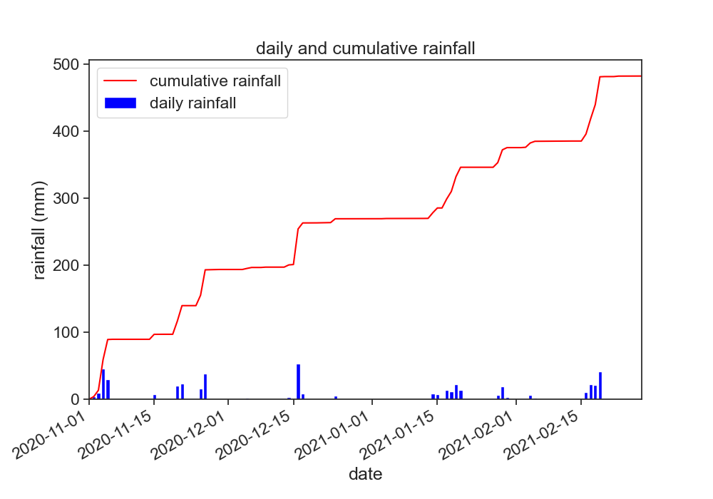
make the following figure
Use the following function to plot bars for daily rainfall
ax.bar(x_array, y_array)
Can you write yourself some lines of code that calculate the cumulative rainfall from the daily rainfall?

- double click this markdown cell to reveal the code I used to produce the figure. Don't do this right away, try to go as far as you can!
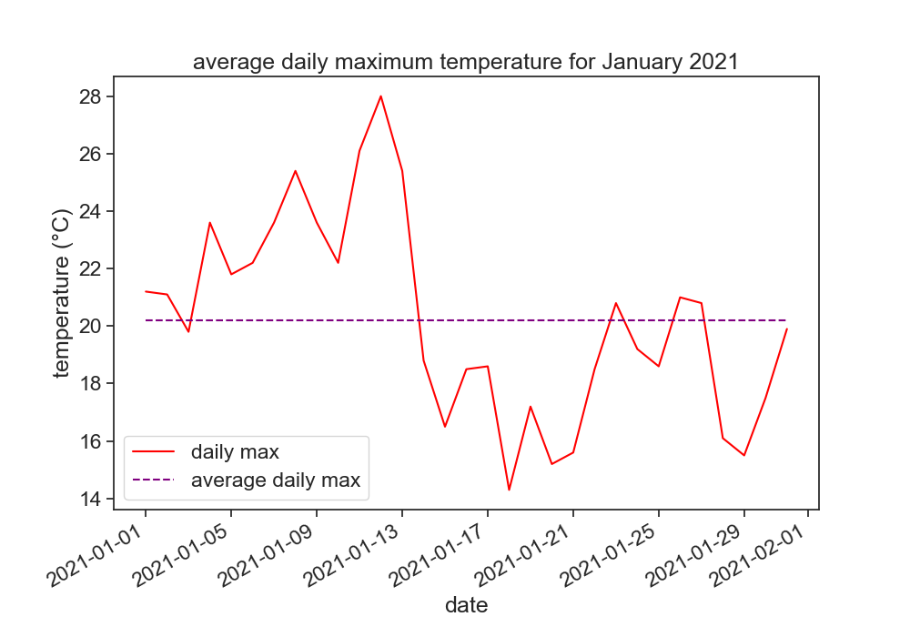
make another figure
In order to choose just a part of the time series, you can use the following:
start_date = '2021-01-01'
end_date = '2021-01-31'
january = df[start_date:end_date]

- double click this markdown cell to reveal the code I used to produce the figure. Don't do this right away, try to go as far as you can!
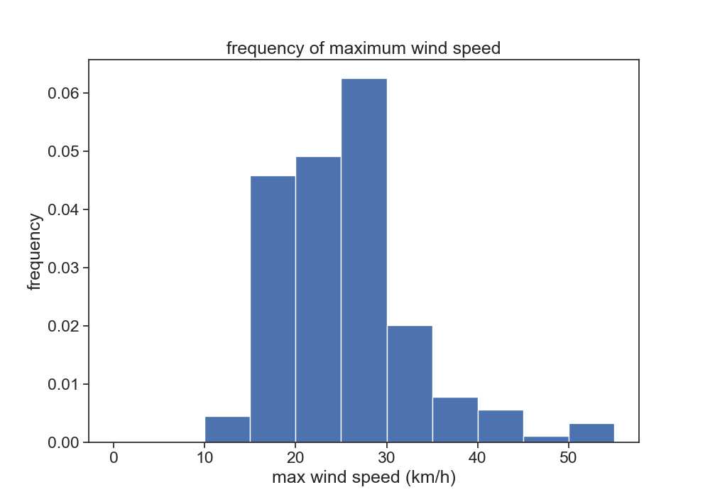
one last figure for today
Use the following code to create histograms with user-defined bins:
b = np.arange(0, 56, 5)  # bins from 0 to 55, width = 5
ax.hist(df['wind'], bins=b, density=True)
Play with the bins, see what happens. What does density=True do?

- double click this markdown cell to reveal the code I used to produce the figure. Don't do this right away, try to go as far as you can!
homework
Go back to the weather station website, download one year of data from 01.01.2020 to 31.12.2020 (24h data).
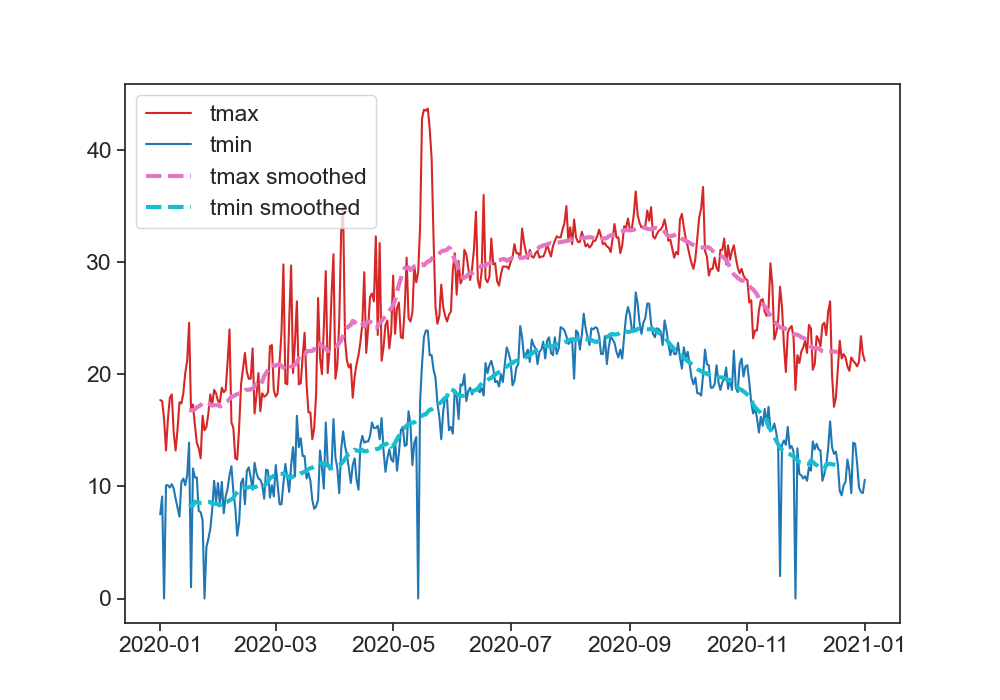
Make the following graph:
- daily tmax and tmin
- smoothed data for tmax and tmin
In order to smooth the data with a 30 day window, use the following function:
df['tmin'].rolling(30, center=True).mean()
This means that you will take the mean of 30 days, and put the result in the center of this 30-day window.
Play with this function, see what you can do with it. What happens when you change the size of the window? Why is the smoothed data shorter than the original data? See the documentation for rolling to find more options.

- double click this markdown cell to reveal the code I used to produce the figure. Don't do this right away, try to go as far as you can!